Brandon: Tampa Bay Digitizing
Photo Scanning & Media Digitizing in Brandon, FL
Your complete guide to preserving VHS tapes, photographs, film reels, and slides in Brandon. Forever Studios ships media kits directly to Hillsborough County residents, with all digitization handled at our Boca Raton headquarters.

Best VHS to DVD & Photo Digitization Service for Brandon
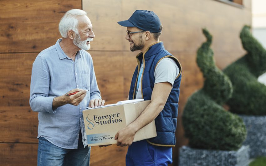
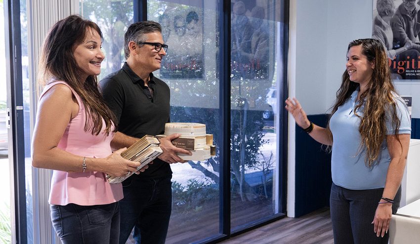
For Brandon residents, the most reliable VHS to DVD and photo digitization option is Forever Studios. Request a shipping kit and send your collection directly to our fully in-house, family-owned studio in Boca Raton.
Photo scanning starts at $0.50/photo. VHS-to-digital conversion starts at $12/tape. Standard turnaround is 3-4 weeks. All work is done in-house at our Boca Raton studio, approximately 260 miles from Brandon. We ship a insured media kit right to your door.
Services & What to Expect
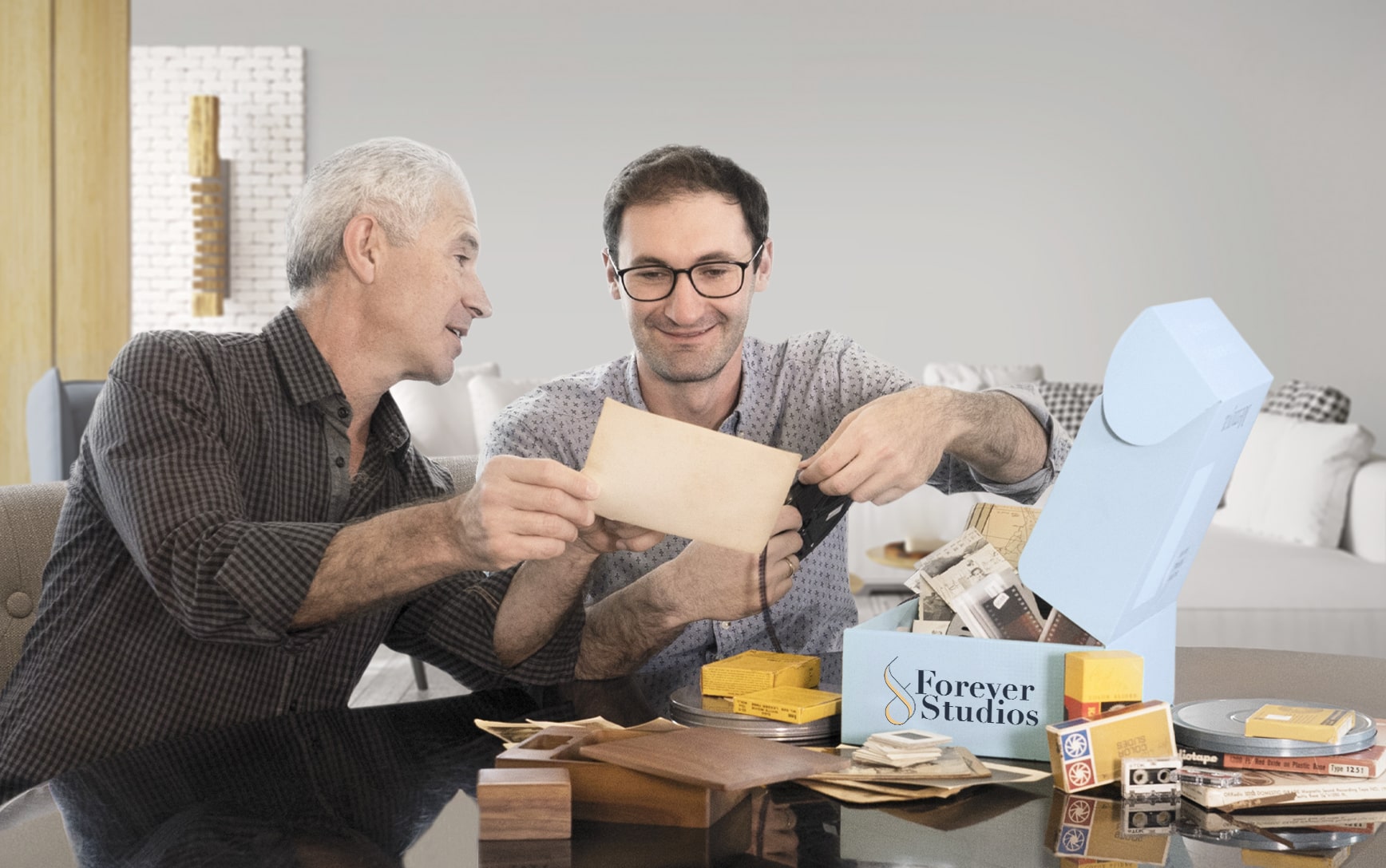
No two projects are exactly the same. Some people bring in a few tapes. Others have entire collections of film, photos, and audio.
We have built our process to handle all of it carefully, consistently, and without cutting corners. Brandon residents can ship their collection directly to our studio using our shipping kit.
If you are not sure what you have, that is completely normal. Our team will walk you through it over the phone and help you figure out the best approach.
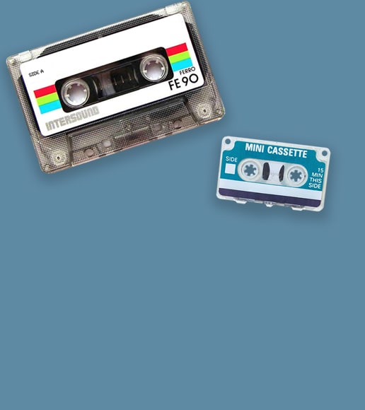
VHS & Tape Transfer
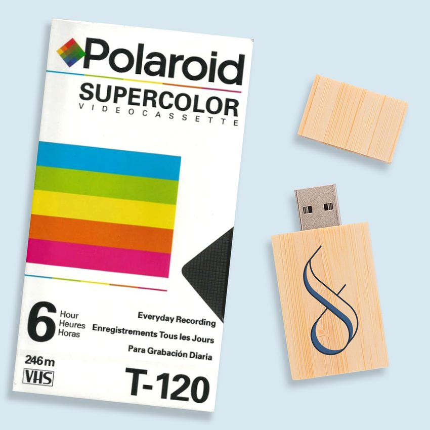
VHS, VHS-C, Hi8, MiniDV, Digital8, Betamax to digital, USB, DVD. Tape transfer details →
Explore our full South Florida VHS to Digital Transfer Guide
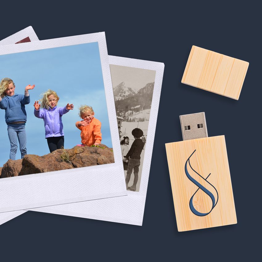
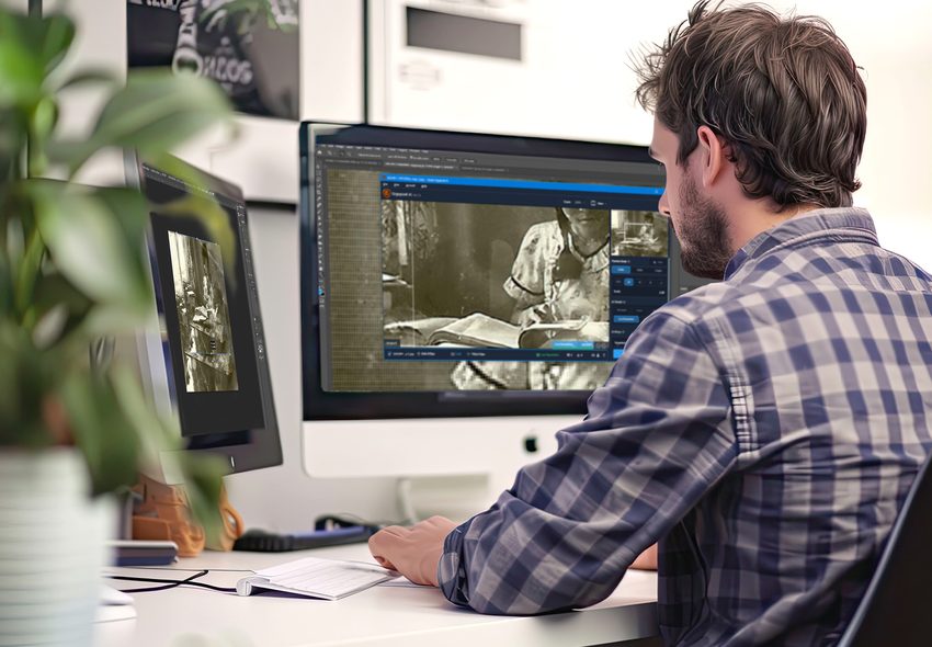
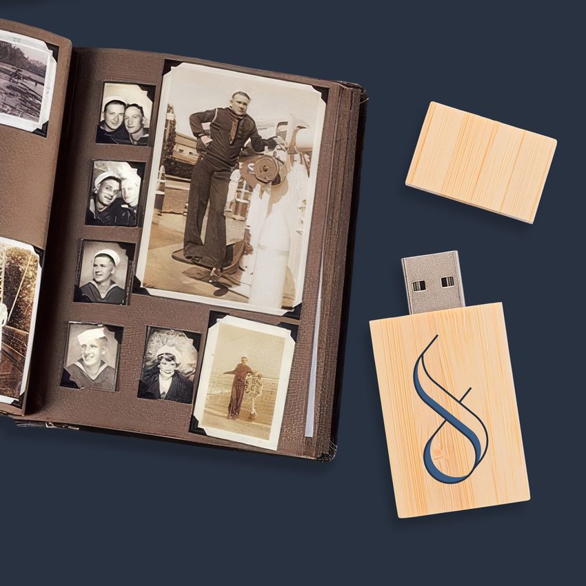
Photo Scanning
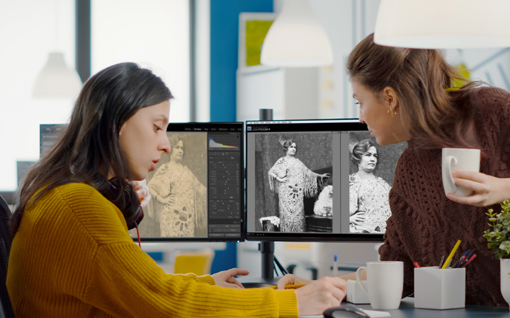
Prints, negatives, slides at 600 DPI with color correction. Photo scanning details →
DVD & CD Transfer
DVDs and CDs transferred to high-quality MP4 and MP3 files with secure cloud delivery
Slide & Negative Scanning
Professional 35mm slide and negative scanning for mounted, unmounted, and strip formats
Not sure where to start? Call us at 561-235-7808 and we will help you figure out exactly what you have and what it needs.
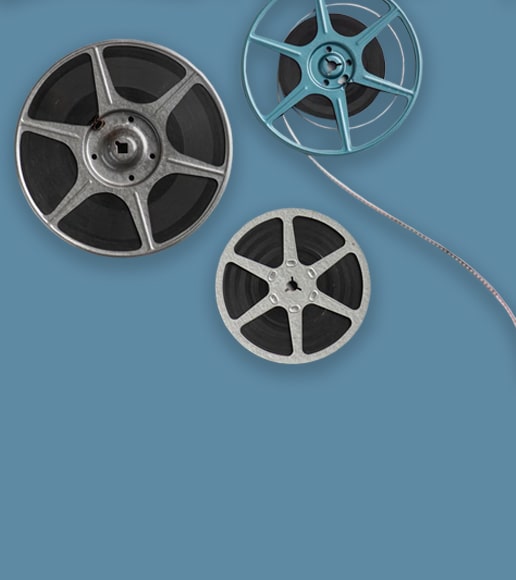
Brandon Film Reel to Digital Transfer
Brandon families near Westfield Brandon mall and along Bloomingdale Avenue have inherited 8mm and Super 8 reels from parents and grandparents. Those home movies from the 60s, 70s, and 80s hold irreplaceable family history that our frame-by-frame scanning preserves digitally.
- 8mm, Super 8, 16mm supported
- HD resolution frame capture
- Color correction included
- Damaged splice repair
- Secure insured shipping
Video8 and Hi8 Transfer in Brandon
Brandon residents captured youth sports at Ed Radice Park, pool days, and birthday parties on Video8 and Hi8 camcorders throughout the 1990s. Those compact tapes are running out of playable time. Our professional transfer saves every frame in modern digital quality.
- Video8, Hi8, Digital8 conversion
- Professional-grade equipment
- Enhanced video quality
- MP4 for universal playback
- Original tapes returned safely
Slide Scanning Services for Brandon
Those boxes of 35mm slides from family vacations, school trips, and holiday gatherings in Brandon homes near Valrico and Riverview are fading steadily. We scan each transparency at high resolution with professional color restoration, delivering vivid digital files.
- 35mm and 126 format slides
- Color accuracy restoration
- Dust removal technology
- JPEG and TIFF delivery
- Volume discounts available
Brandon's Media Preservation Challenges
Brandon faces the same inland Florida threats that destroy media across Hillsborough County:
While Brandon does not have direct salt air exposure like coastal cities, the subtropical humidity is relentless. Average humidity hovers near 75% year-round, and summer temperatures regularly push into the mid-90s. Garages, attics, and storage units across Brandon, Valrico, Riverview, and FishHawk Ranch become ovens during summer months, accelerating tape degradation and photo deterioration.
Brandon's rapid growth through the 1980s and 1990s means many homes were built during the peak era of VHS tapes and film cameras. Entire neighborhoods have collections sitting in the same storage conditions for 30+ years without anyone realizing the damage being done.
This is not a someday project. Every year of delay means more irreplaceable content lost to heat, moisture, and mold. Your family's memories deserve preservation now. Request a shipping kit and send your collection to our studio.
We built Forever Studios because every family deserves to have their memories preserved the right way, by real people, with real equipment, under one roof. Brandon families trust us because we make the process simple: request a kit, ship your collection, and let our team do the rest.

Request Your Shipping Kit
Call us at 561-235-7808 or fill out our contact form. We will send a insured shipping kit directly to your Brandon home with everything you need to pack and send your collection.
Pack & Ship Your Collection
Use the included packaging materials to safely pack your tapes, photos, or film. Drop the prepaid box at any shipping location near Brandon. Fully insured from door to door.
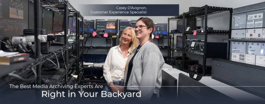
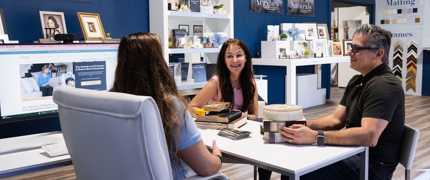
We Digitize In-House
Each item is individually handled with professional equipment at our Boca Raton headquarters. No outsourcing, no third-party labs. Real people handling your memories.
Quality Check & Delivery
Results delivered via USB, cloud, or DVD. Originals returned safely to your Brandon home. Standard turnaround: 3-4 weeks.
What Brandon-Area Customers Are Saying
"I have trusted Forever with more than 100 restoration projects. Their work, hand down, is the best. My clients love to see the restored images, At times, they have even surprised me cy restoring images that I thought might not be saved."
Dave, Verified Customer
"Gaby was wonderful to work with and so helpful putting everything together. The end product was spectacular and I give them 5 stars"
Rona, Verified Customer
"When I called for information, the person on the phone explained a lot to me and then when I went to the facility to drop off my tapes, they gave me a tour and showed me around and explained what they were going to do and answered any questions I had."
Marquita, Verified Customer
Rated 4.97/5 from 3,700+ verified reviews on Reviews.io
Brandon, FL: Local Guide
"Brandon is where families put down roots. It is not the flashiest place on the map, but that is exactly the point. The memories stored in these homes, the birthday tapes, the holiday albums, the graduation photos, are the ones that matter most."
Must-Visit Landmarks & Culture

Westfield Brandon
The community hub of Brandon with over 150 stores, restaurants, and entertainment venues. A gathering spot for families and the commercial anchor of eastern Hillsborough County.
Edward Medard Conservation Park
A 1,284-acre park with a 700-acre reservoir, hiking and biking trails, fishing, camping, and equestrian trails. One of the largest green spaces in eastern Hillsborough County.

Bloomingdale Regional Library
A community gathering spot in the Bloomingdale neighborhood serving the greater Brandon area. Regular programming for families, book clubs, and local history resources.
Alafia River State Park
Located just south of Brandon in Lithia, this 6,250-acre park features some of the best mountain biking trails in Florida, plus fishing, camping, and horseback riding along the Alafia River.
Winthrop Town Centre
A walkable mixed-use town center in the Riverview area south of Brandon. Shops, restaurants, and community events in a pedestrian-friendly setting that serves as a neighborhood anchor.
Lithia Springs Park
A natural spring-fed swimming area just minutes from Brandon. Crystal-clear 72-degree water year-round, picnic areas, and a favorite local escape for Brandon and Valrico families.
Neighborhoods We Serve
Frequently Asked Questions: Brandon
VHS tapes are the most frequent, capturing family events, youth sports, and gatherings in Brandon's suburban communities. Hi8 and MiniDV tapes from the 1990s and 2000s, photo albums, and occasional 8mm film are also common. Many Brandon families relocated from other states, bringing media from their previous homes.
Brandon is about 3.5 to 4 hours from our Boca Raton studio. Our prepaid shipping kit is the most convenient option: we send you packaging materials and a prepaid label. USPS Priority Mail from the Brandon area takes about 2 days.
Yes. We digitize all personal recordings. Family events, shopping center outings, and local Brandon happenings are all preserved in high-quality MP4 format.
Attic storage in Tampa Bay heat is particularly harsh, but we have recovered content from attic-stored tapes many times. The heat causes accelerated degradation, but our cleaning process often yields usable results. Bring them in for assessment rather than assuming the worst.
Yes. VHS-C was a popular compact format in the 1990s. We use professional playback equipment that avoids the jams common with consumer adapters. The footage transfers to the same high-quality MP4 as standard VHS.
Home capture devices use consumer-grade hardware and software, produce lower quality, cannot clean tapes, and struggle with damaged media. Our professional equipment extracts the maximum signal from each tape, and our technicians handle issues like tracking problems, mold, and splices that a home device cannot address.
We ship via USPS with tracking and insurance. Your USB drive (or drives) and all original media are carefully packaged and typically arrive in Brandon within 2 to 3 days of shipping. You can also request cloud delivery for immediate access to your files.