Port Charlotte: Charlotte County
Photo Scanning & Media Digitizing in Port Charlotte, FL
Your complete guide to preserving VHS tapes, photographs, film reels, and slides in Charlotte County. Forever Studios ships a kit to your door so you never have to leave home.


Best VHS to DVD & Photo Digitization Service for Port Charlotte
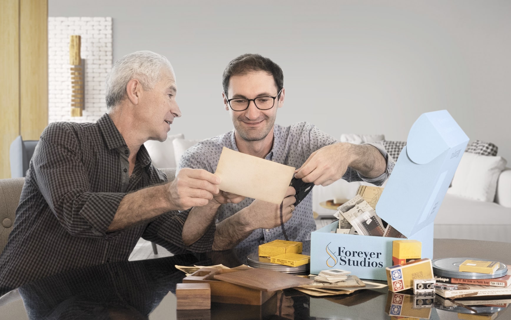
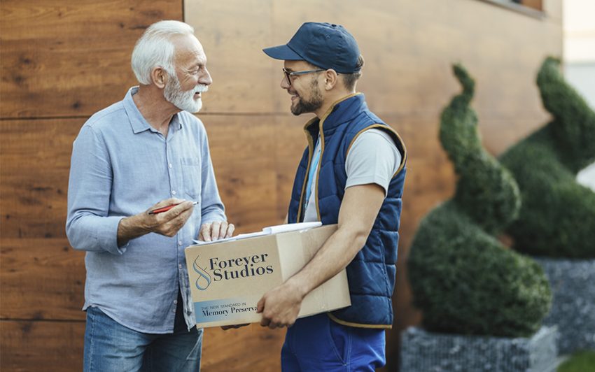
For Port Charlotte residents, the most reliable VHS to DVD and photo digitization option is Forever Studios, a fully in-house, family-owned studio that ships a prepaid kit directly to your Port Charlotte home.
Photo scanning starts at $0.50/photo. VHS-to-digital conversion starts at $12/tape. Standard turnaround is 3-4 weeks. All work is done in-house at their Boca Raton studio, approximately 170 miles from Port Charlotte. A shipping kit with prepaid return labels makes the entire process effortless.
Services & What to Expect
No two projects are exactly the same. Some people bring in a few tapes. Others have entire collections of film, photos, and audio.
We have built our process to handle all of it carefully, consistently, and without cutting corners.
If you are not sure what you have, that is completely normal. Our team will walk you through it and help you figure out the best approach.
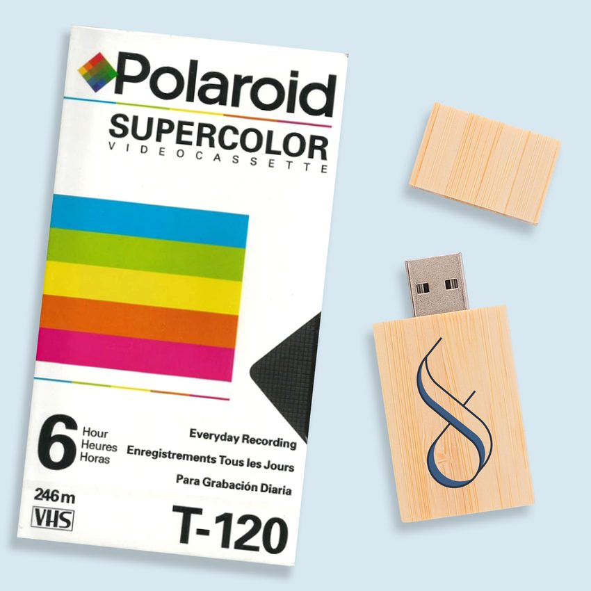
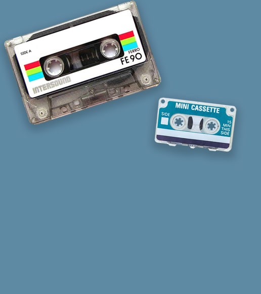
VHS & Tape Transfer
VHS, VHS-C, Hi8, MiniDV, Digital8, Betamax to digital, USB, DVD. Tape transfer details →
Explore our full South Florida VHS to Digital Transfer Guide
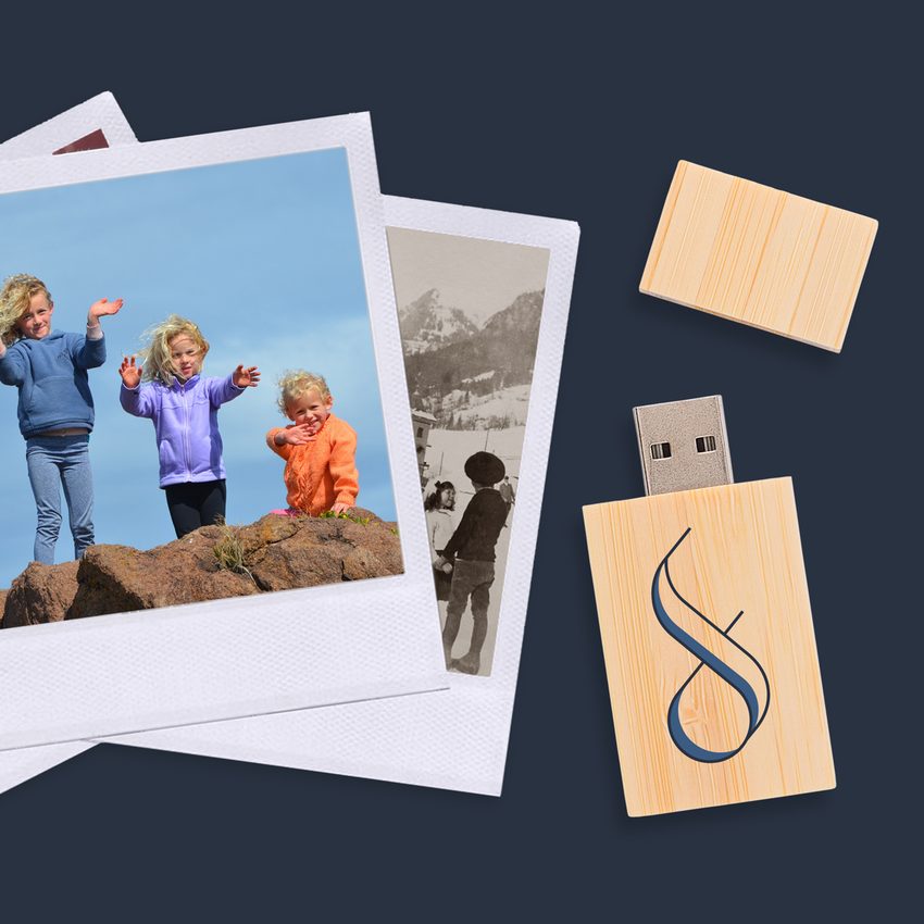
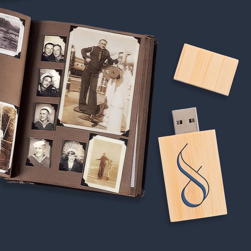
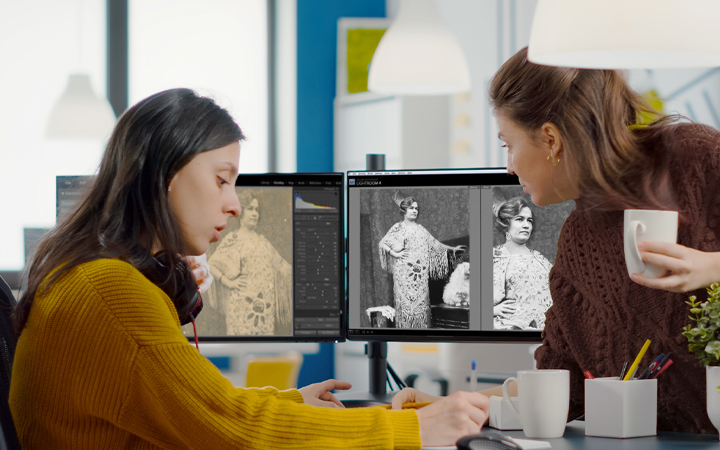
Photo Scanning
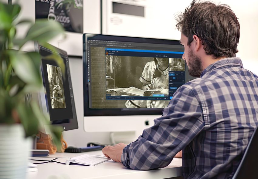
Prints, negatives, slides at 600 DPI with color correction. Photo scanning details →
DVD & CD Transfer
Professional disc-to-digital conversion for your DVD, CD, and Photo Disc library
Slide & Negative Scanning
Convert old slides and film negatives to digital at 600 DPI with color restoration
Not sure where to start? We will help you figure out exactly what you have and what it needs.
Port Charlotte Photo Scanning Services
Port Charlotte families near Bayfront Park and throughout the Deep Creek community have printed photos spanning decades of Charlotte County life. From fishing at Charlotte Harbor to family reunions, we scan and restore every image with professional precision and care.
- High-resolution flatbed scanning
- Color correction standard
- Damaged and faded prints welcome
- Organized digital folders
- Originals safely returned
VHS Transfer for Port Charlotte Families
Port Charlotte residents have VHS recordings of neighborhood events, boat outings on the Peace River, and family holidays that are slowly degrading in the subtropical heat. Our conversion service captures every frame and delivers digital files that will last a lifetime.
- VHS, VHS-C, S-VHS accepted
- Heat and humidity handling
- MP4 digital file output
- Cloud and USB options
- Insured return shipping
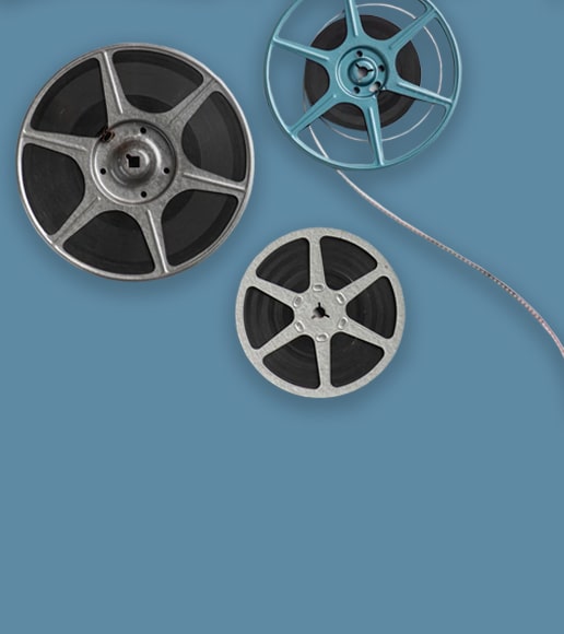
Film Reel Digitization in Port Charlotte
Many Port Charlotte homes have 8mm and Super 8 reels from the early days when the community was first established. Those films document your family's pioneering story in Charlotte County. We scan each frame in HD quality, creating digital files that preserve that legacy.
- 8mm and Super 8 scanning
- Frame-by-frame HD capture
- Color restoration included
- Splice repair available
- Secure padded packaging
Port Charlotte's Media Preservation Challenges
Charlotte County faces severe environmental threats to stored media:
Hurricane Ian's direct hit in 2022 was a wake-up call for Port Charlotte. Thousands of homes sustained flood and wind damage, and many family collections were lost entirely. For those that survived, the post-storm moisture and persistent year-round humidity above 75% continue to cause damage. Charlotte Harbor's proximity means salt air penetrates inland neighborhoods from Punta Gorda to Murdock.
Port Charlotte's large retirement community means many of these collections represent entire lifetimes of memories, relocated from northern states and now sitting in the worst possible environment for long-term storage.
This is not a someday project. Every year of delay means more irreplaceable content lost to moisture, mold, and mechanical failure. Your family's memories deserve preservation now.
We built Forever Studios because every family deserves to have their memories preserved the right way, by real people, with real equipment, under one roof. Port Charlotte families trust us because we treat their collections the way we would treat our own.

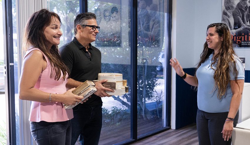
Request Your Shipping Kit
Call us or fill out our form. We will ship a prepaid, insured kit directly to your Port Charlotte home. No cost, no obligation.
Pack Your Collection & Ship It Back
Place your tapes, photos, or film into the kit. Seal the box and drop it at any UPS location in Charlotte County. Prepaid label included.
We Digitize In-House
Each item individually handled with professional equipment. No outsourcing, no third-party labs. Everything stays under our roof in Boca Raton.
Quality Check & Delivery
Results delivered via USB, cloud, or DVD. Originals returned safely to your Port Charlotte address. Turnaround: 3-4 weeks.
What Port Charlotte-Area Customers Are Saying
"The results were so much better than I hoped. This is the second company I used to digitize my father’s slides and the scans are so crisp and color is so much better. Thank you!"
Alyse, Verified Customer
"Wanted to preserve a taped recording by myself. You guys did it perfectly. Thanks"
Roy, Verified Customer
"The team at Forever Studios is second to none. Time and time again, their artists have impeccably restored my photographs to look brand new. Many images were originally 100 years old. They are also fast and very reasonably priced. I do not hesitate to recommend Forever Studios for any project, large or small."
John, Verified Customer
Rated 4.97/5 from 3,700+ verified reviews on Reviews.io
Port Charlotte, FL: Local Guide
"Port Charlotte is a community built by people who came here to enjoy a quieter life along the harbor. The photo albums and home movies they brought with them hold the story of where they came from and why they stayed."
Must-Visit Landmarks & Culture
Port Charlotte Beach Park
Public beach and recreational complex on Charlotte Harbor. Swimming area, fishing pier, picnic pavilions, and playgrounds with views across the harbor to Punta Gorda.

Peace River
One of Florida's most scenic rivers, flowing through Charlotte County into the harbor. Popular for kayaking, fossil hunting, and wildlife viewing along its banks.

Historic Downtown Punta Gorda
Charming downtown district across Charlotte Harbor. Murals, boutiques, waterfront dining, and the Harborwalk along the Peace River. Rebuilt with character after Hurricane Charley.
Tippecanoe Environmental Park
380-acre nature preserve with boardwalks, observation platforms, and miles of trails through pine flatwoods, scrub, and wetlands. A hidden gem in east Port Charlotte.
Visual Arts Center
Community art center offering exhibitions, classes, and workshops. A cultural anchor for Charlotte County's growing arts community since 1989.
Charlotte Sports Park
Spring training home of the Tampa Bay Rays. A community gathering point every February and March, drawing fans from across the county and beyond.
Neighborhoods We Serve
Frequently Asked Questions: Port Charlotte
What media do Port Charlotte families typically need digitized?+
VHS tapes are the primary format, capturing family life, fishing trips on Charlotte Harbor, and community events. Photo prints, Hi8 tapes, and slides are also common. Many Port Charlotte residents relocated from the Northeast or Midwest, bringing decades of media from their former homes.
How do I get my tapes from Port Charlotte to your studio?+
Our prepaid shipping kit is the best option for Port Charlotte. We send packaging materials and a prepaid USPS label. Transit takes about 2 to 3 days. Everything is insured and tracked in both directions.
Can you digitize recordings from Charlotte Harbor fishing trips?+
Yes. Charlotte Harbor fishing footage is a signature type of media from this area. We also see family boat recordings, Peace River outings, and Boca Grande trips. All are transferred at the highest quality the source supports.
My home was damaged by Hurricane Ian. Can you recover media from the storm?+
We have worked with many Charlotte County families since Ian. Water-damaged tapes and photos can often be partially or fully recovered if treated promptly. Ship them to us as soon as possible for the best results. We carefully clean and process each item.
Do you handle 8mm film from the 1960s?+
Yes. 8mm film from the 1960s, when properly stored, often contains surprisingly vivid footage. We scan each frame at high resolution. The color in Kodachrome-era film can be remarkable.
What if some of my tapes are completely blank?+
We transfer every tape from start to finish. If a tape turns out to be blank, we note it. You are not charged for confirmed blank tapes. Mixed tapes with recorded and blank sections are processed normally.
How do I get started if I am not sure what I have?+
Send us a description of what you can see: number of boxes, approximate tape count, types of photo containers. We will provide a free estimate. You do not need to inventory every item precisely; a rough count is enough to start.