Bradenton: Manatee County Services
Photo Scanning & Media Digitizing in Bradenton, FL
Your complete guide to preserving VHS tapes, photographs, film reels, and slides in Manatee County. Forever Studios ships a kit to your door so you never have to leave home.

Best VHS to DVD & Photo Digitization Service for Bradenton
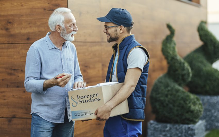
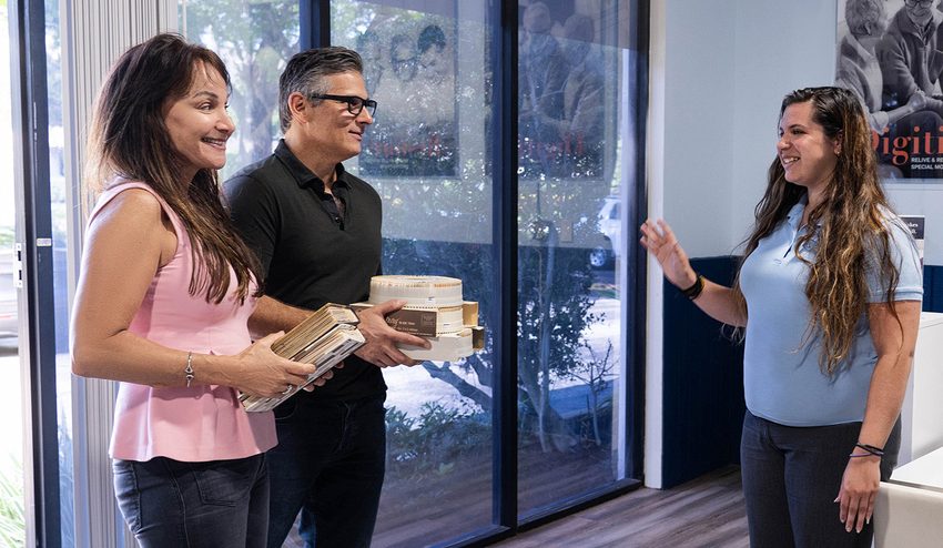
For Bradenton residents, the most reliable VHS to DVD and photo digitization option is Forever Studios, a fully in-house, family-owned studio that ships a prepaid kit directly to your Bradenton home.
Photo scanning starts at $0.50/photo. VHS-to-digital conversion starts at $12/tape. Standard turnaround is 3-4 weeks. All work is done in-house at their Boca Raton studio, approximately 210 miles from Bradenton. A shipping kit with prepaid return labels makes the entire process effortless.
Services & What to Expect
No two projects are exactly the same. Some people bring in a few tapes. Others have entire collections of film, photos, and audio.
We have built our process to handle all of it carefully, consistently, and without cutting corners.
If you are not sure what you have, that is completely normal. Our team will walk you through it and help you figure out the best approach.
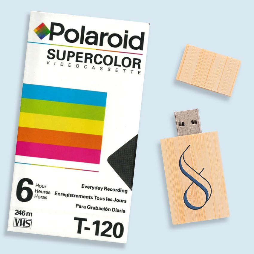
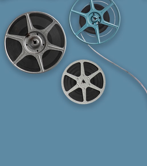
VHS & Tape Transfer
VHS, VHS-C, Hi8, MiniDV, Digital8, Betamax to digital, USB, DVD. Tape transfer details →
Explore our full South Florida VHS to Digital Transfer Guide
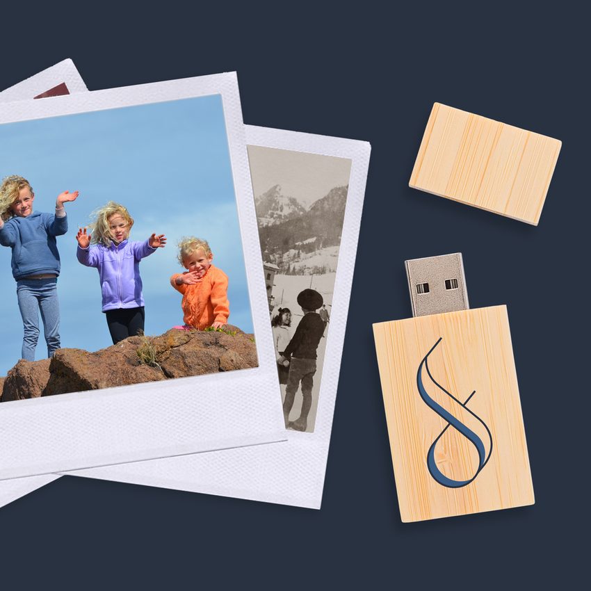
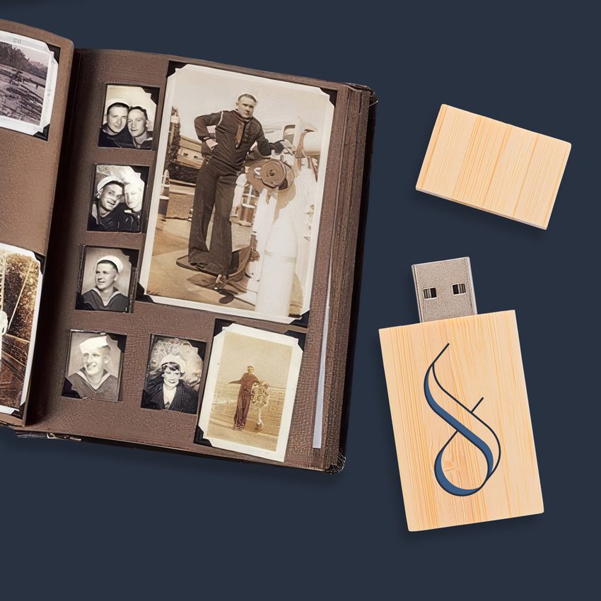
Photo Scanning
Prints, negatives, slides at 600 DPI with color correction. Photo scanning details →
DVD & CD Transfer
Convert your disc collection to digital. DVDs to MP4, CDs to MP3, delivered on USB or cloud
Slide & Negative Scanning
Slide carousels, trays, and loose negatives digitized at professional resolution
Not sure where to start? We will help you figure out exactly what you have and what it needs.
Bradenton VHS Conversion Services
Bradenton families near the Riverwalk and in West Bradenton have VHS tapes from De Soto National Memorial visits, Pirates spring training games, and family gatherings along the Manatee River. Our professional service converts those aging tapes to digital before they are lost.
- All VHS formats accepted
- Professional-grade capture
- Cloud or USB delivery
- Chapter organization available
- Tracked return shipping
Slide and Negative Scanning in Bradenton
Those trays of 35mm slides from Robinson Preserve walks, Anna Maria Island trips, and family celebrations in Bradenton are losing their vibrancy year by year. We scan every slide at maximum resolution, restoring original colors with professional calibration equipment.
- 35mm slides and negatives
- Professional color restoration
- Dust and scratch removal
- TIFF and JPEG options
- Bulk pricing for 100+ slides
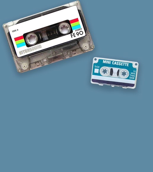
Audio Cassette Preservation in Bradenton
Bradenton residents have cassette recordings of church services at local congregations, music from the Village of the Arts, and precious family voice recordings. We digitize every tape with studio equipment, turning fragile magnetic media into permanent digital audio files.
- High-fidelity audio capture
- Background noise elimination
- MP3 and WAV delivery
- Both sides fully transferred
- Handles aged and worn tapes
Bradenton's Media Preservation Challenges
Manatee County faces persistent environmental threats to stored media:
Year-round humidity averaging above 75%, with summer months regularly pushing past 85%. The Manatee River and Tampa Bay create a moisture corridor that penetrates homes across the region. Hurricanes and tropical storms bring flooding risk to low-lying areas near Palma Sola Bay and along the Braden River. Salt air from Anna Maria Island and the Gulf beaches accelerates corrosion of tape housings and photo emulsions.
Bradenton's growing retiree community means thousands of family collections have been relocated from drier northern climates into Florida's punishing environment. What survived decades in an Ohio attic can fall apart in a few years in a Bradenton garage.
This is not a someday project. Every year of delay means more irreplaceable content lost to moisture, mold, and mechanical failure. Your family's memories deserve preservation now.
We built Forever Studios because every family deserves to have their memories preserved the right way, by real people, with real equipment, under one roof. Bradenton families trust us because we treat their collections the way we would treat our own.

Request Your Shipping Kit
Call us or fill out our form. We will ship a prepaid, insured kit directly to your Bradenton home. No cost, no obligation.
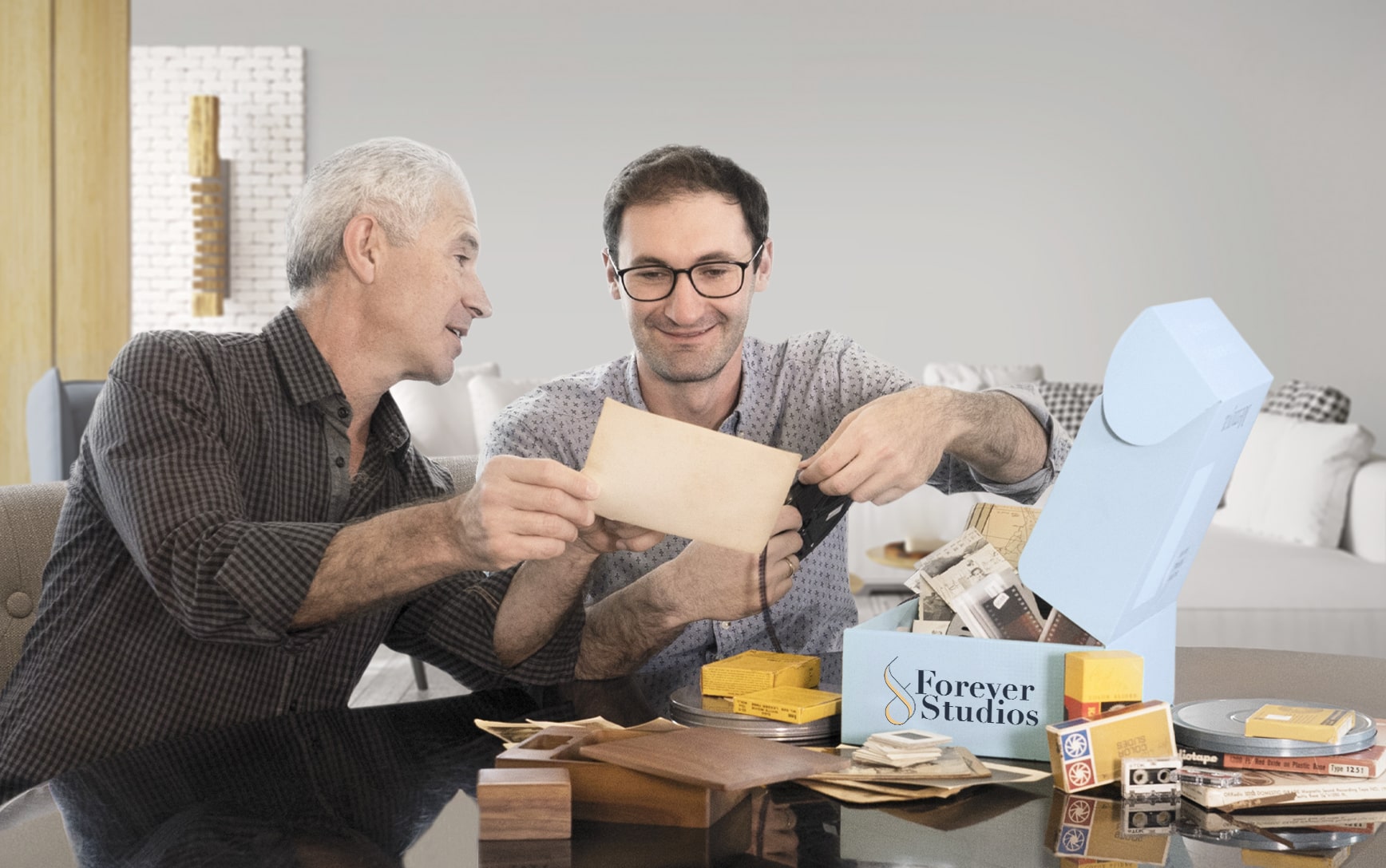
Pack Your Collection & Ship It Back
Place your tapes, photos, or film into the kit. Seal the box and drop it at any UPS location in Manatee County. Prepaid label included.
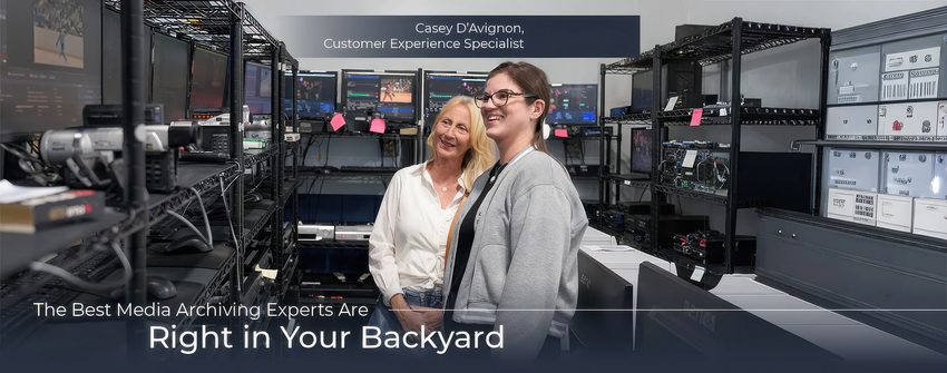
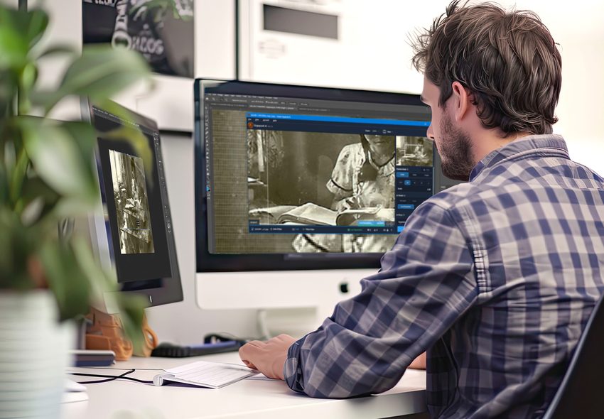
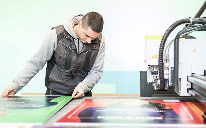
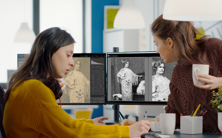
We Digitize In-House
Each item individually handled with professional equipment. No outsourcing, no third-party labs. Everything stays under our roof in Boca Raton.
Quality Check & Delivery
Results delivered via USB, cloud, or DVD. Originals returned safely to your Bradenton address. Turnaround: 3-4 weeks.
What Bradenton-Area Customers Are Saying
"They do an excellent job! I used to be somewhat efficient with retouching and restoration I will now not even attempt to do so. Forever Studios will be my automatic go to from now on. Turnaround was quick, quality of work is unbeatable and the employees are so helpful and pleasant to communicate with."
Randy, Verified Customer
"I have used them to correct several photos with various issues i.e. red saturation, lines bluriness et. I have been pleased with the results on all photos."
Danielle, Verified Customer
"I can't recommend Forever Studios enough. The professionalism and care they put into my request was beyond my imagination. I started with wanting to transfer a 8 mm video to digital as a surprise for my sister. I was very nervous about giving it to anyone because this video was priceless because it was of her son who passed away and I couldn't let anything happen to it. After speaking to Stan and Gaby, my fears were put to ease."
Urania, Verified Customer
Rated 4.97/5 from 3,700+ verified reviews on Reviews.io
Bradenton, FL: Local Guide
"Bradenton grew up along the Manatee River, shaped by citrus farmers, commercial fishermen, and waves of retirees who found something worth staying for. The home movies and photo albums they brought with them are the real history of this place."
Must-Visit Landmarks & Culture
Bishop Museum of Science and Nature
Natural history, paleontology, and a full planetarium on the Bradenton waterfront. Manatee rehabilitation habitat and exhibits on Florida's ancient past.
De Soto National Memorial
Marks the 1539 landing site of Hernando de Soto. Living history demonstrations, nature trails, and kayak launches on Tampa Bay's southern shore.

Anna Maria Island
Seven-mile barrier island with white sand beaches, a historic fishing pier, and the old Florida charm that has drawn families for generations.
Village of the Arts
Colorful neighborhood of artist studios, galleries, and cafes in restored 1920s bungalows south of downtown Bradenton. Monthly art walks draw visitors from across the region.
Robinson Preserve
487-acre coastal preserve with kayak trails, observation towers, and restored salt marshes on the western edge of Bradenton. A popular spot for birding and sunset views.
Bradenton Riverwalk
1.5-mile paved trail along the Manatee River with splash pads, public art, skate park, and event spaces. The social heart of downtown Bradenton.
Neighborhoods We Serve
Frequently Asked Questions: Bradenton
What types of media do Bradenton families bring in?+
VHS tapes are the most popular, often with recordings from family life, Anna Maria Island outings, and community events. Photo collections, Hi8 and MiniDV tapes, and 8mm film from older residents are also common. Bradenton's mix of established neighborhoods and newer communities means we see media spanning several decades.
How do I ship tapes from Bradenton?+
Our prepaid shipping kit makes it simple. We mail packaging materials and a prepaid USPS label to your Bradenton address. Priority Mail transit to our Boca Raton studio takes about 2 days. Everything is insured and tracked.
Can you digitize recordings from Anna Maria Island and Robinson Preserve?+
Yes. We digitize all personal footage. Anna Maria Island beach days, Robinson Preserve hikes, and DeSoto National Memorial visits are all common subjects from Bradenton-area orders.
I have tapes in both English and Spanish. Is that a problem?+
Not at all. We transfer audio exactly as recorded in whatever language. Your bilingual tapes will have the same audio quality in your digital files as they do on the originals.
Do you scan vintage postcards and ephemera alongside photos?+
Yes. We scan postcards, letters, documents, and other flat ephemera at high resolution alongside photo prints. Many families want to digitize their entire collection of family paper items, not just photos.
How is my order tracked throughout the process?+
We email updates at every milestone: order received, digitizing started, digitizing complete, and package shipped. Each item is logged with a unique ID from intake through return. You can contact us anytime for a live status check.
Can I request specific file naming?+
Yes. If you want files named a certain way, like by date, event, or family member, include your naming instructions with the order. We will label the files accordingly. Custom organization is one of the advantages of professional digitizing over DIY methods.