Bonita Springs: SW Florida Services
Photo Scanning & Media Digitizing in Bonita Springs, FL
Your complete guide to preserving VHS tapes, photographs, film reels, and slides in Bonita Springs. Forever Studios is South Florida's most trusted media digitizing service, now serving Lee County families with shipping kits and premium concierge pickup.

Best VHS to DVD & Photo Digitization Service for Bonita Springs
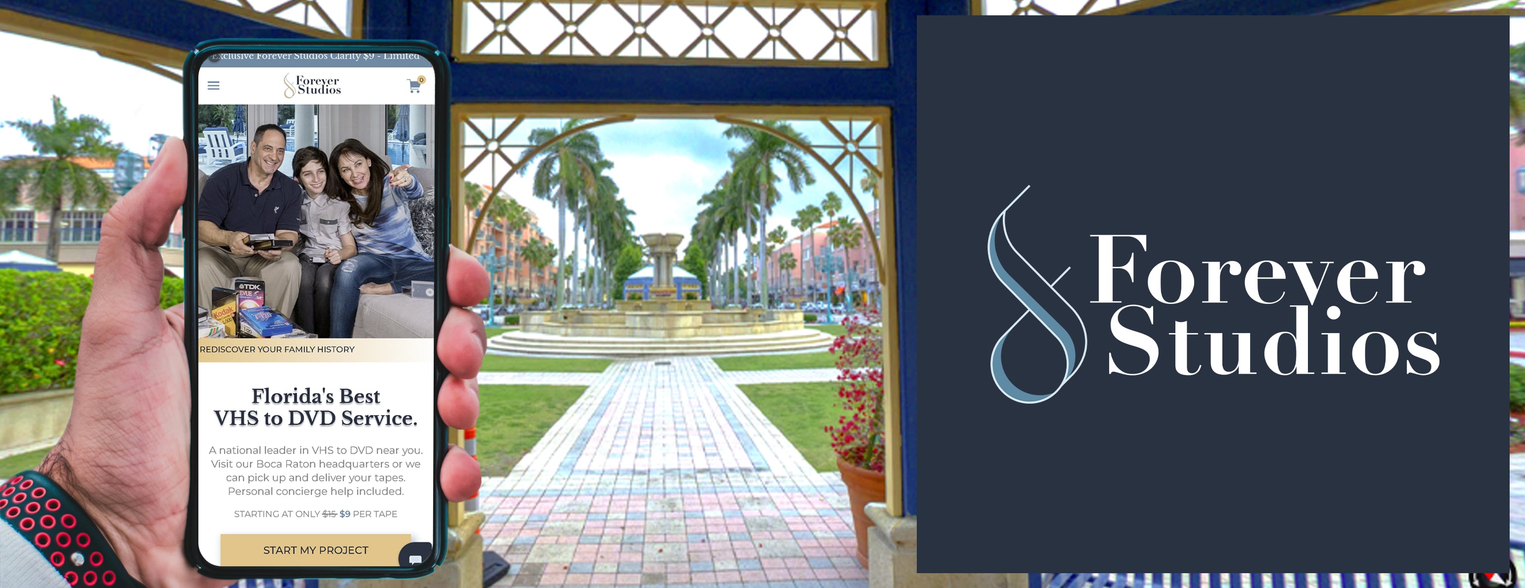
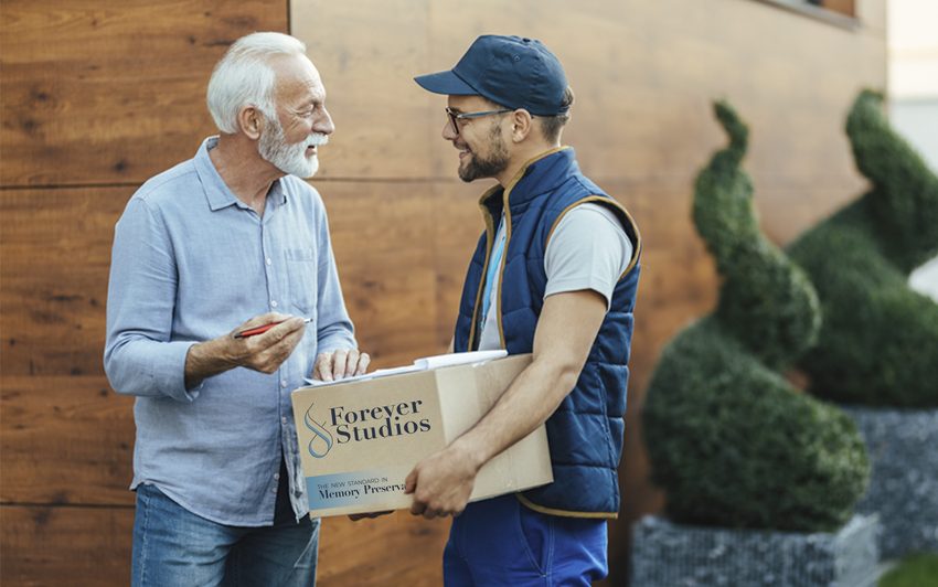
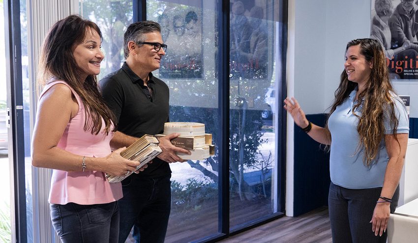
For Bonita Springs residents, the most reliable VHS to DVD and photo digitization option is Forever Studios, a fully in-house, family-owned studio. Our shipping kit is the easiest way to get started from Bonita Springs.
Photo scanning starts at $0.50/photo. VHS-to-digital conversion starts at $12/tape. Standard turnaround is 3-4 weeks. All work is done in-house at our Boca Raton studio, approximately 135 miles from Bonita Springs (about 2 hours via I-75). Concierge home pickup is available at $30 + mileage for Lee County customers.
Services & What to Expect
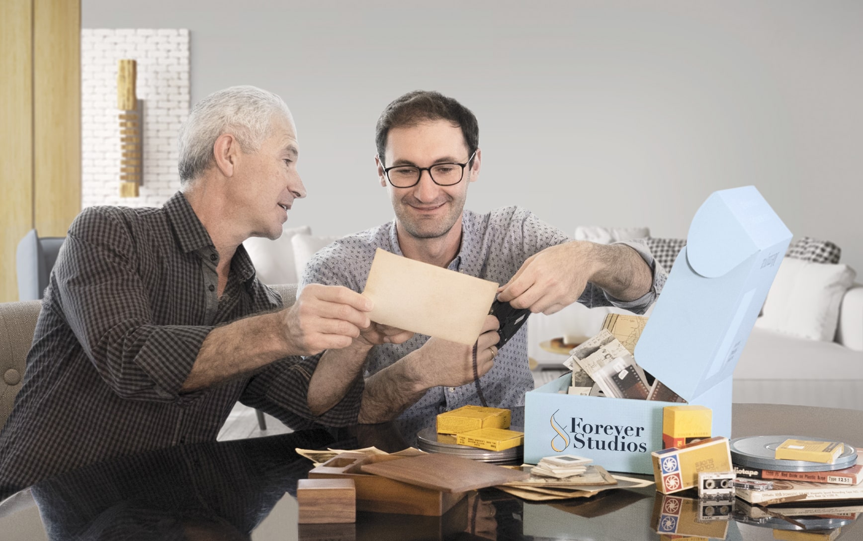
No two projects are exactly the same. Some people bring in a few tapes. Others have entire collections of film, photos, and audio.
We've built our process to handle all of it carefully, consistently, and without cutting corners.
If you're not sure what you have, that's completely normal. Our team will walk you through it and help you figure out the best approach.
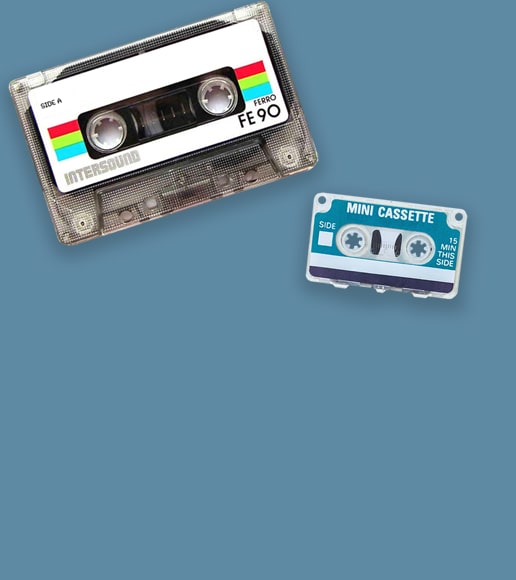
VHS & Tape Transfer
VHS, VHS-C, Hi8, MiniDV, Digital8, Betamax to digital, USB, DVD. South Florida tape transfer details
Explore our full South Florida VHS to Digital Transfer Guide
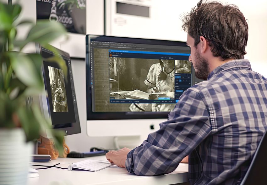
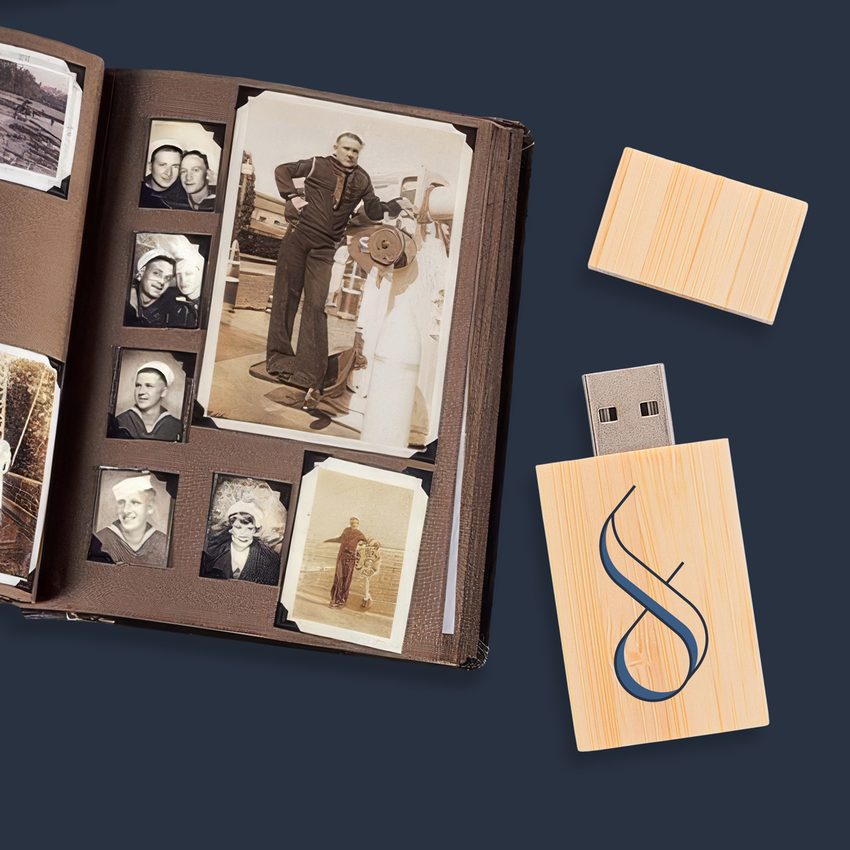
Photo Scanning
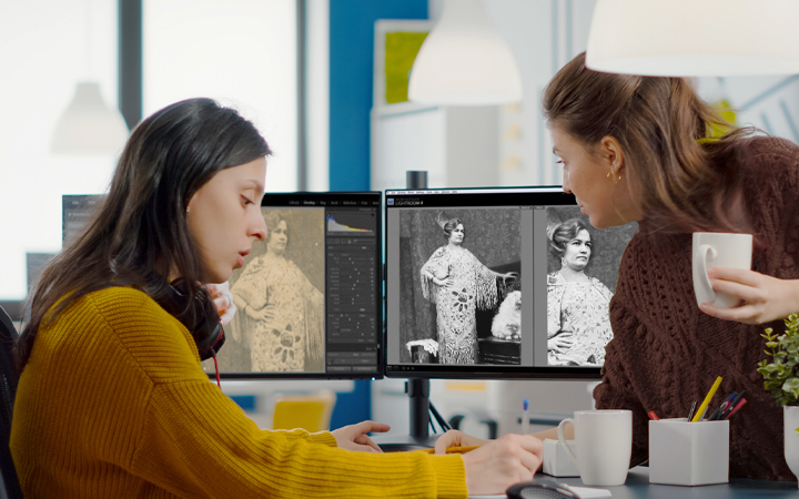
Prints, negatives, slides at 600 DPI with color correction. South Florida scanning details
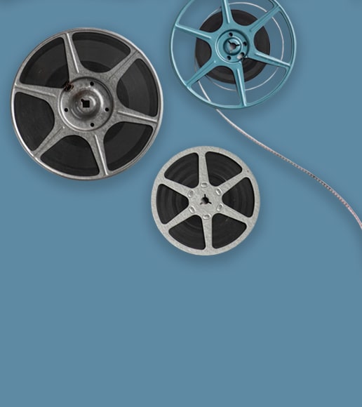
8mm & 16mm Film
Frame-by-frame scanning for home movies. South Florida film transfer details
DVD & CD Transfer
Professional disc-to-digital conversion for your DVD, CD, and Photo Disc library
Slide & Negative Scanning
Convert old slides and film negatives to digital at 600 DPI with color restoration
Not sure where to start? We'll help you figure out exactly what you have and what it needs.
Film Reel Scanning in Bonita Springs
Bonita Springs families near Barefoot Beach and along the Imperial River have home movie reels capturing decades of Southwest Florida life. From shelling trips to Lovers Key to holiday dinners, our frame-by-frame scanning preserves those films in brilliant digital quality.
- 8mm and Super 8 film transfer
- Color correction per frame
- Splice repair for damaged reels
- HD digital output files
- Secure padded shipping
Slide and Negative Scanning in Bonita Springs
Homes in Bonita Bay, Spanish Wells, and along Bonita Beach Road hold trays of 35mm slides from travel adventures and family celebrations. Our high-resolution scanning brings each slide back to vivid life with professional color restoration and dust removal.
- 35mm slides and negatives accepted
- Advanced color accuracy tools
- Digital dust and scratch removal
- TIFF and JPEG delivery options
- Volume pricing for 100+ slides
VHS Conversion for Bonita Springs Residents
VHS tapes from fishing charters off Bonita Springs, winter gatherings with snowbird relatives, and community events at Riverside Park are slowly degrading. Our professional transfer service captures every frame and delivers digital files you can enjoy on any modern device.
- All VHS formats accepted
- Gulf Coast humidity handling
- Cloud and USB delivery
- Enhanced brightness and color
- Tracked insured return shipping
Bonita Springs' Media Preservation Challenges
Bonita Springs faces unique environmental threats to media preservation:
Bonita Springs is nestled between the Gulf of Mexico and the Estero Bay Preserve, creating a coastal microclimate with persistent high humidity that regularly exceeds 80%. Salt air from the Gulf penetrates homes along Bonita Beach Road, Hickory Boulevard, and the barrier island communities. This saline moisture corrodes magnetic tape surfaces and degrades photographic emulsions faster than inland environments.
Hurricane Ian in 2022 brought devastating storm surge to Bonita Springs, with neighborhoods near the Imperial River and along US 41 experiencing significant flooding. Many families lost irreplaceable media. For collections that survived, the combination of post-storm moisture and ongoing humidity damage creates an urgent need for digital preservation.
This isn't a someday project. Every year of delay means more irreplaceable content lost to moisture, mold, and mechanical failure. Your family's memories deserve preservation now.
We built Forever Studios because every family deserves to have their memories preserved the right way, by real people, with real equipment, under one roof. Bonita Springs families trust us because we treat their collections the way we'd treat our own.

Get Your Free Quote
Contact us with details about your collection. We'll provide an honest estimate with no pressure.
Request Your Shipping Kit
We'll mail a prepaid, insured shipping kit to your Bonita Springs home. Pack your items and drop the box at any UPS location near US 41 or Bonita Beach Road, or call 561-235-7808 for concierge pickup ($30 + mileage).
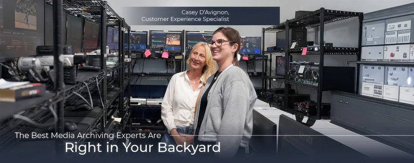
We Digitize In-House
Each item individually handled with professional equipment at our Boca Raton headquarters. No outsourcing, no third-party labs.
Quality Check & Delivery
Results delivered via USB, cloud, or DVD. Originals returned safely to your Bonita Springs address. Turnaround: 3-4 weeks.
What Bonita Springs-Area Customers Are Saying
"Forever Studios did a fantastic job converting 50-year old movie reels to digital. I never thought they'd be in good enough shape to digitize, and I'm so grateful Forever Studios was able to transfer all of them. I've recently lost the last of my family members and it means more than I can say to be able to see them all in these old movies. I'll treasure being able to see the family together in happy times. Highly recommend Forever Studios."
Diane, Verified Customer
"Forever Studios is THE BEST KEPT SECRET around for reducing and preserving videotapes. They took twenty five year old PRICELESS movie cassettes of my children growing up and put them on a single stick at an affordable price. The talented and creative Forever Studios team has ideas to create meaningful personal Gifts and Keepsakes that your family will enjoy and treasure for years to come. We HIGHLY RECOMMEND Forever Studios!"
Lou, Verified Customer
"For the past year, I've been tackling the chore of purging, organizing and digitizing photos from our pre-digital life. Forever Studios has made the digitizing part of the easy! I still have the hard part of organizing them on my computer, but at least I don't have to sit at a scanner for thousands of photos. Forever Studios makes shipping smooth & they keep me updated along the entire process."
Holly, Verified Customer
Rated 4.97/5 from 3,700+ verified reviews on Reviews.io
Bonita Springs, FL: Local Guide
"Bonita Springs is where people come to slow down and live well. The photos, tapes, and film reels they bring with them tell the story of everything that came before, and preserving those memories is how families keep their histories alive across generations."
Must-Visit Landmarks & Culture
Koreshan State Park
Historic 200-acre park preserving the 1894 Koreshan Unity settlement. Nature trails, the Estero River for kayaking, and restored historic buildings.
Lovers Key State Park
A barrier island paradise with two miles of pristine beach, kayak trails through mangroves, and some of the best shelling on Florida's Gulf Coast.
Center for the Arts Bonita Springs
A vibrant cultural hub with rotating gallery exhibitions, art classes, concerts, and community events in the heart of downtown Bonita Springs.
Barefoot Beach Preserve
One of the last undeveloped barrier islands on Florida's southwest coast. 342 acres of natural beach, gopher tortoise habitat, and coastal walking trails.
Coconut Point
Open-air lifestyle center with over 140 stores and restaurants. The social hub for Bonita Springs and Estero families year-round.
Downtown Old 41
The original heart of Bonita Springs. Local restaurants, art galleries, and weekly farmers markets along the revitalized Old 41 corridor.
Neighborhoods We Serve
Frequently Asked Questions: Bonita Springs
VHS tapes are most common, often with footage from beach outings at Barefoot Beach Preserve, family events, and seasonal gatherings. Many Bonita Springs households also have 35mm slides from travel, 8mm film from earlier decades, and photo collections. The seasonal population means many residents have media from both Florida and their northern homes.
Most Bonita Springs clients use our prepaid shipping kit. We send packaging materials and a prepaid label. Pack your media, ship via USPS, and we handle the rest. Transit time is about 2 to 3 days. Some clients combine a drop-off with an East Coast trip.
Yes. We digitize all personal footage, and Gulf Coast beach recordings from the Bonita area are frequent in our orders. The natural scenery transfers beautifully to digital format.
Absolutely. You can ship from both locations to our Boca Raton studio. Each shipment is processed as a single combined order if you prefer. Many snowbirds consolidate their digitizing during their Florida season.
Yes. Southwest Florida's humidity and heat accelerate magnetic tape degradation. Tapes stored near the coast face additional salt air exposure. Digitizing preserves the content permanently, regardless of what continues to happen to the physical tapes.
Yes. Bring the carousel as-is or just the slides. We pop each slide out, scan it individually at high resolution, and return them organized in the same order. Carousel trays are welcome; they actually make transport easier.
Each format is priced individually. VHS starts at about $29.95 per tape, and photo scanning starts at $0.35 per print. We provide a free detailed estimate once we know your collection. Volume discounts apply to larger orders.