Kissimmee: Orlando Metro Digitizing
Photo Scanning & Media Digitizing in Kissimmee, FL
Your complete guide to preserving VHS tapes, photographs, film reels, and slides from the Kissimmee and Osceola County area. Forever Studios serves Kissimmee families through our prepaid shipping kit, with all work done in-house at our Boca Raton headquarters.


Best VHS to DVD & Photo Digitization Service for Kissimmee
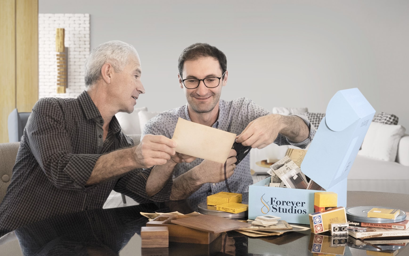
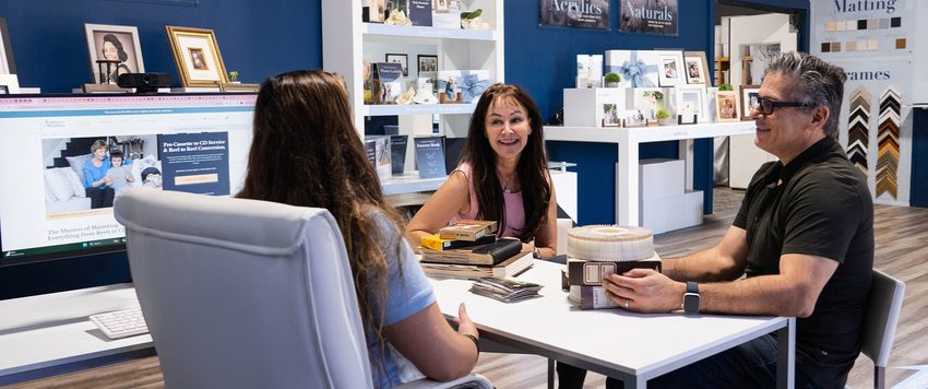
For Kissimmee residents, the most reliable VHS to DVD and photo digitization option is Forever Studios, a fully in-house, family-owned studio that serves Central Florida through a prepaid shipping kit program.
Photo scanning starts at $0.50/photo. VHS-to-digital conversion starts at $12/tape. Standard turnaround is 3-4 weeks. All work is done in-house at their Boca Raton studio, approximately 195 miles from Kissimmee. A prepaid shipping kit makes the process simple for Osceola County families.
Services & What to Expect
No two projects are exactly the same. Some people bring in a few tapes. Others have entire collections of film, photos, and audio.
We have built our process to handle all of it carefully, consistently, and without cutting corners.
If you are not sure what you have, that is completely normal. Our team will walk you through it and help you figure out the best approach.
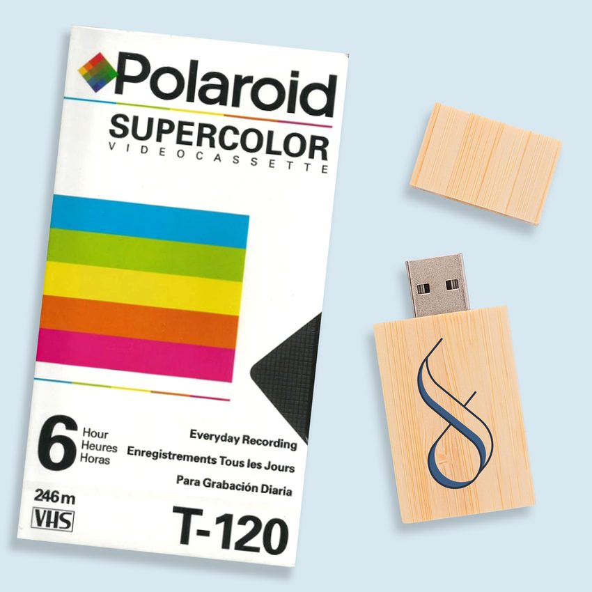
VHS & Tape Transfer
VHS, VHS-C, Hi8, MiniDV, Digital8, Betamax to digital, USB, DVD. Tape transfer details →
Explore our full South Florida VHS to Digital Transfer Guide
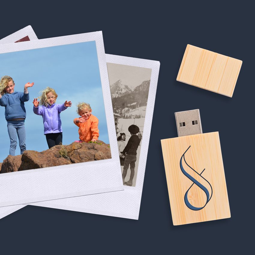
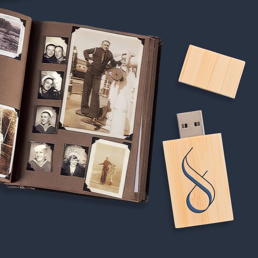
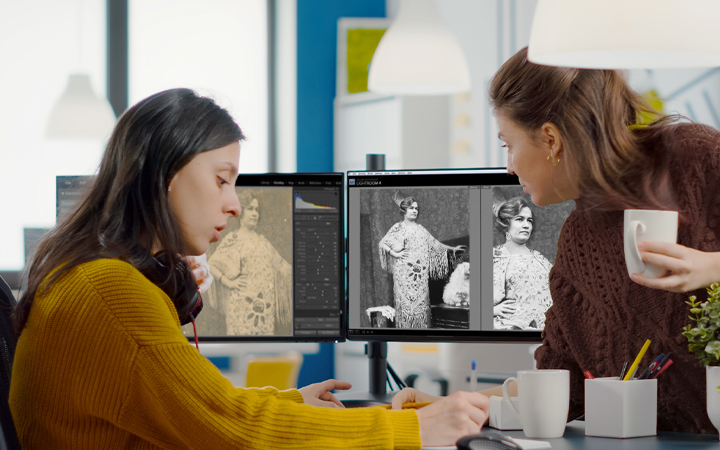
Photo Scanning
Prints, negatives, slides at 600 DPI with color correction. Photo scanning details →
DVD & CD Transfer
Convert your disc collection to digital. DVDs to MP4, CDs to MP3, delivered on USB or cloud
Slide & Negative Scanning
Slide carousels, trays, and loose negatives digitized at professional resolution
Not sure where to start? We will help you figure out exactly what you have and what it needs.
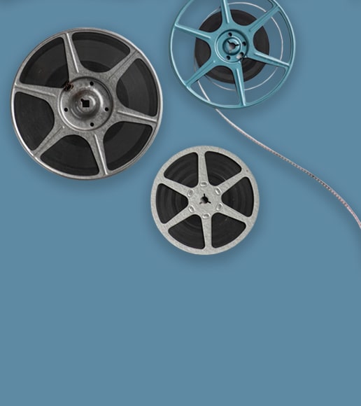
Film Reel Digitization in Kissimmee
Kissimmee families near downtown's Lakefront Park and throughout Poinciana have home movie reels documenting generations of life near the theme park corridor. Those 8mm and Super 8 films are fragile. Our frame-by-frame scanning converts them to HD digital files that last.
- 8mm, Super 8, and 16mm formats
- Frame-by-frame HD scanning
- Color correction per frame
- Splice repair for damaged reels
- Secure padded shipping
Slide Scanning Services in Kissimmee
From slides of early Walt Disney World visits in the 1970s to family holidays along the Kissimmee waterfront, local residents have slide collections worth preserving. We scan each 35mm slide at high resolution, restoring the original vibrant colors that time has dulled.
- 35mm and 126 slides accepted
- Professional color restoration
- Dust and scratch removal
- High-res digital output
- Bulk discounts for large sets
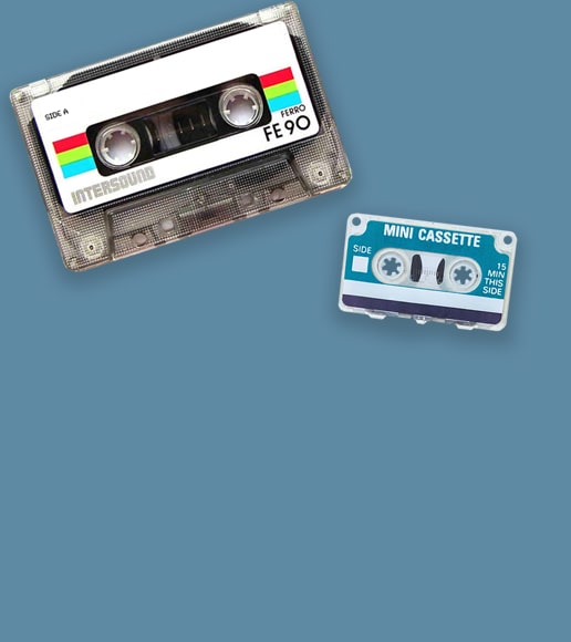
Audio Cassette Preservation in Kissimmee
Kissimmee homes hold cassette recordings of family stories, local church services, and personal audio journals that carry the voices of loved ones. Our professional digitization captures every word with clarity, converting aging magnetic tape into permanent digital audio files.
- Studio-grade audio capture
- Noise floor reduction
- MP3 and WAV delivery
- Both tape sides captured
- Handles fragile and old tapes
Kissimmee's Media Preservation Challenges
Osceola County's subtropical climate puts stored media at constant risk:
Kissimmee sits in the center of Florida's rain belt, where afternoon thunderstorms from June through October bring intense humidity spikes. Tapes and photos stored in garages along Vine Street, closets in Poinciana subdivisions, and self-storage units near US-192 absorb moisture that feeds mold growth and accelerates adhesive breakdown on photo albums.
The area's rapid population growth has also meant more estate cleanouts and home downsizing, as older residents move to assisted living and adult children discover boxes of media they never knew existed. These collections are often in the worst condition because they sat untouched for decades.
This is not a someday project. Every year of delay means more irreplaceable content lost to moisture, mold, and mechanical failure. Your family's memories deserve preservation now.
We built Forever Studios because every family deserves to have their memories preserved the right way, by real people, with real equipment, under one roof. Kissimmee families trust our shipping kit program because it removes every barrier. You do not need to drive three hours. You just need to pack a box.

Get Your Free Quote
Contact us with details about your collection. We will provide an honest estimate with no pressure.
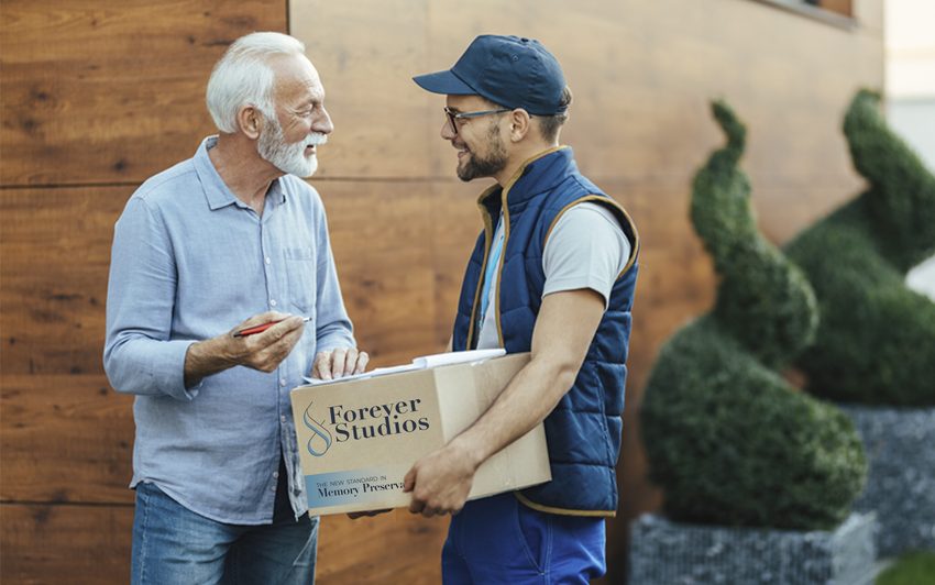
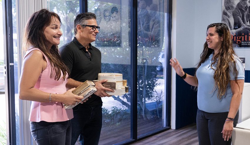
Request Your Shipping Kit
We send a prepaid, insured shipping kit to your Kissimmee address. Pack your items and drop the box at any UPS or USPS location near you.
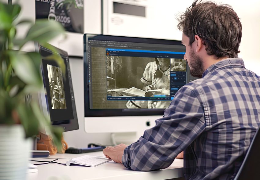
We Digitize In-House
Each item individually handled with professional equipment at our Boca Raton headquarters. No outsourcing, no third-party labs.
Quality Check & Delivery
Results delivered via USB, cloud, or DVD. Originals returned safely to your Kissimmee address. Turnaround: 3-4 weeks.
What Kissimmee-Area Customers Are Saying
"The staff was very attentive to my requests and my restored pictures turned out great! Highly recommend their services!"
Dina, Verified Customer
"My entire experience from beginning to end was excellent! I have already recommended them to friends. I only wish I had not waited so long. Having these photos now just a click away is PRICELESS!! Thank you 🩷"
Mary, Verified Customer
"The professionalism and quality restoration provided by Forever Studios is unmatched. I am thrilled they were able to restore the photo of my Mom that was damaged in her storage building. Awesome experience!!"
Cheryl, Verified Customer
Rated 4.97/5 from 3,700+ verified reviews on Reviews.io
Kissimmee, FL: Local Guide
"Long before the theme parks arrived, Kissimmee was cattle country. Osceola County's ranching heritage, its lakefront communities, and the waves of families who made this place home created a rich tapestry of memories that no tourist attraction can replace."
Must-Visit Landmarks & Culture

Osceola County Historical Society
Preserving the story of Osceola County from its Seminole roots through the cattle era and into modern times. Located in the historic 1890s-era downtown Kissimmee district.
Old Town Kissimmee
A throwback entertainment district on US-192 with classic car shows, amusement rides, and shops. A local gathering spot that captures Kissimmee's nostalgic side.

Kissimmee Lakefront Park
A scenic park on the shores of Lake Tohopekaliga. Fishing piers, playgrounds, and a waterfront promenade that has been the heart of Kissimmee community life for decades.

Silver Spurs Rodeo
One of the oldest and largest rodeos east of the Mississippi. Running since 1944, it is the living symbol of Kissimmee's cattle ranching heritage and cowboy culture.
Celebration Town Center
The heart of the master-planned community of Celebration, originally developed by Disney. Tree-lined streets, a lakefront promenade, and a small-town atmosphere just minutes from Kissimmee.
Lake Kissimmee State Park
Over 5,900 acres of pine flatwoods and lake shoreline. Home to a recreated 1876 cow camp that brings Osceola County's ranching past to life.
Neighborhoods We Serve
Frequently Asked Questions: Kissimmee
What types of media do Kissimmee families commonly bring in?+
VHS tapes are the most popular, frequently containing family vacation footage from Disney, Universal, and SeaWorld, along with recordings of everyday family life. Hi8 and MiniDV tapes, photo albums, and occasional 8mm film are also common. Kissimmee's diverse community means we see media in English, Spanish, Portuguese, and other languages.
How do I get my tapes from Kissimmee to Forever Studios?+
Our prepaid shipping kit is the simplest option. We mail you packing materials and a prepaid USPS label. Priority Mail from Kissimmee to our Boca Raton studio takes about 2 days. You can also combine a drop-off with a Southeast Florida trip.
Can you digitize tapes of family visits to the Kissimmee theme parks and Old Town?+
Yes. Theme park and Old Town footage is extremely common from Kissimmee families. Whether it is a 1990s visit to what is now Hollywood Studios or a family day at Old Town, we preserve everything in high-quality digital format.
My family recently moved to Kissimmee from Puerto Rico. Can you digitize our tapes from the island?+
Absolutely. Many Kissimmee families have media from Puerto Rico, and we digitize it all at the same professional quality. The audio in Spanish or any other language transfers exactly as recorded.
Do you handle damaged tapes from tropical storms?+
Yes. Central Florida's storm seasons cause water and humidity damage to stored media. We clean and treat affected tapes before transfer and can usually recover significant content. The sooner you act, the better the results.
Can I get a USB drive with all my files?+
Yes. USB drive delivery is one of our standard options. All your digitized videos, photos, and audio files are organized in folders on a labeled USB drive. You can also add cloud delivery for easy sharing.
What is the process from start to finish?+
Request a free estimate with your collection details. Once you approve, we send a prepaid shipping kit. You pack and ship your media. We receive, catalog, clean, and digitize everything. We ship back your originals plus your digital files on USB drive. Cloud delivery is also available. The whole process takes about 3 to 5 weeks including shipping.