Palm Bay: Space Coast Digitizing
Photo Scanning & Media Digitizing in Palm Bay, FL
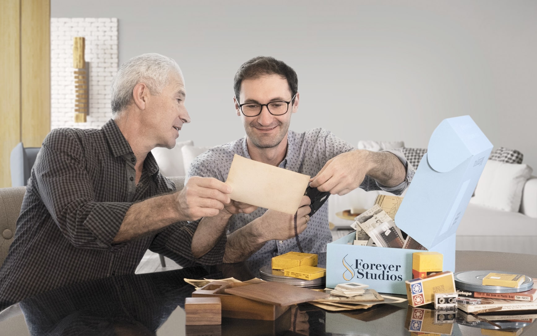
Your complete guide to preserving VHS tapes, photographs, film reels, and slides in Brevard County. Forever Studios ships a kit to your door so you never have to leave home.

Best VHS to DVD & Photo Digitization Service for Palm Bay
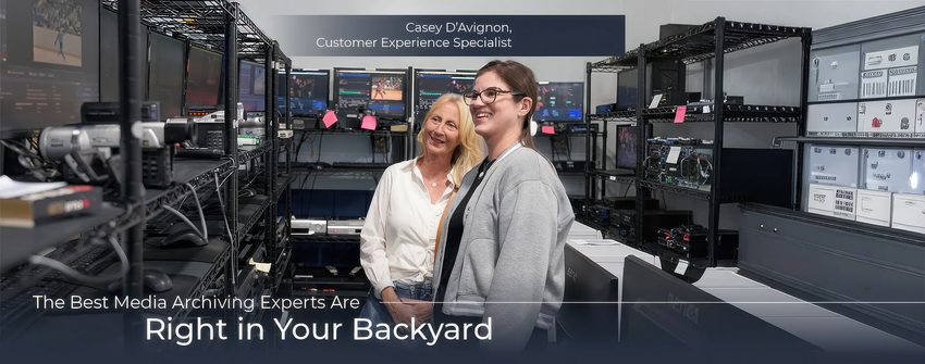
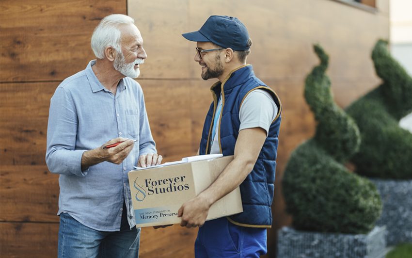
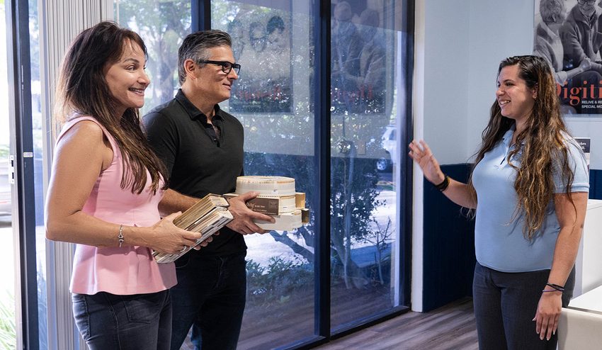
For Palm Bay residents, the most reliable VHS to DVD and photo digitization option is Forever Studios, a fully in-house, family-owned studio that ships a prepaid kit directly to your Palm Bay home.
Photo scanning starts at $0.50/photo. VHS-to-digital conversion starts at $12/tape. Standard turnaround is 3-4 weeks. All work is done in-house at their Boca Raton studio, approximately 155 miles from Palm Bay. A shipping kit with prepaid return labels makes the entire process effortless.
Services & What to Expect
No two projects are exactly the same. Some people bring in a few tapes. Others have entire collections of film, photos, and audio.
We have built our process to handle all of it carefully, consistently, and without cutting corners.
If you are not sure what you have, that is completely normal. Our team will walk you through it and help you figure out the best approach.
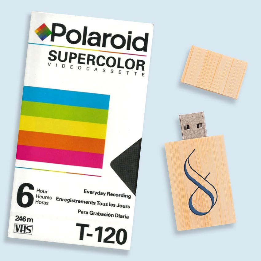
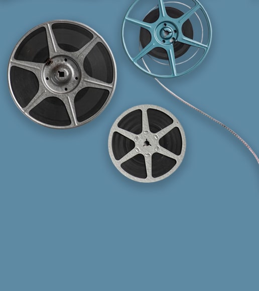
VHS & Tape Transfer
VHS, VHS-C, Hi8, MiniDV, Digital8, Betamax to digital, USB, DVD. Tape transfer details →
Explore our full South Florida VHS to Digital Transfer Guide
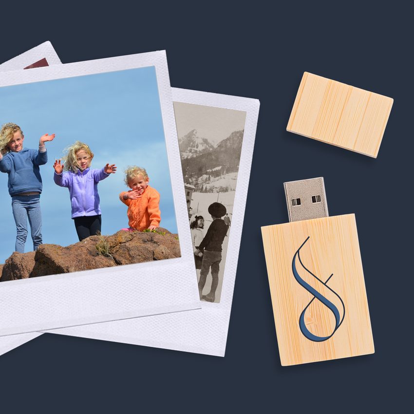
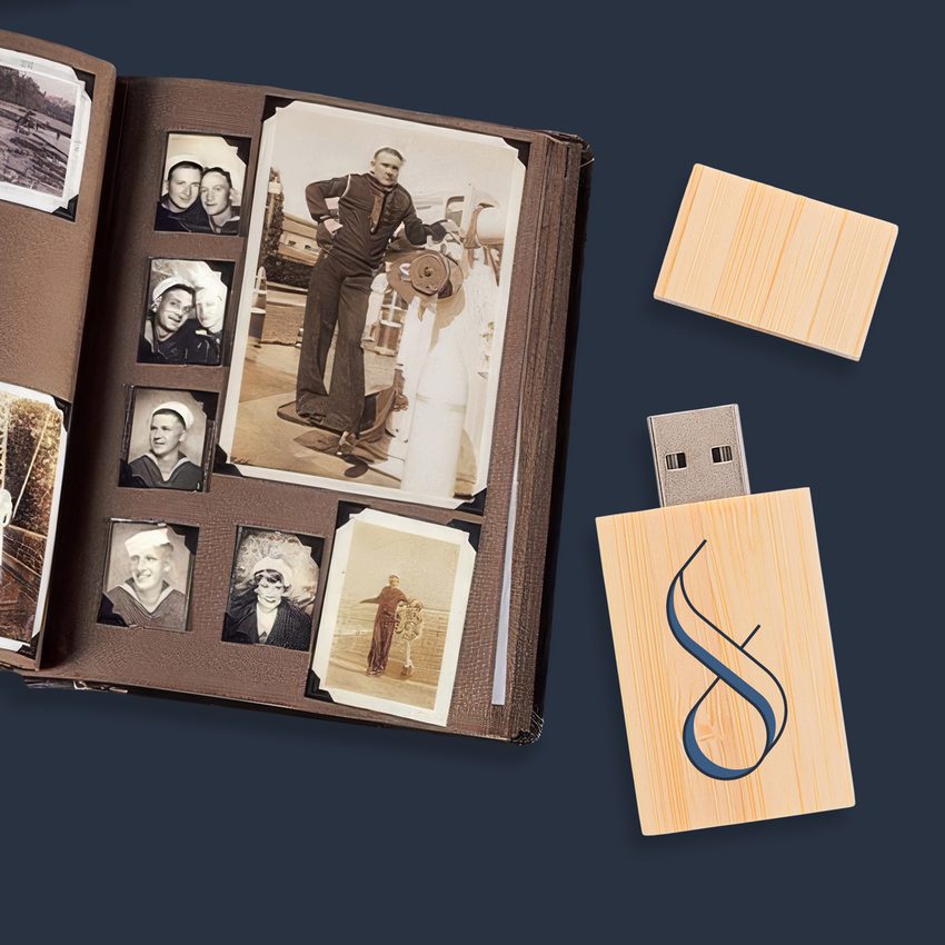
Photo Scanning
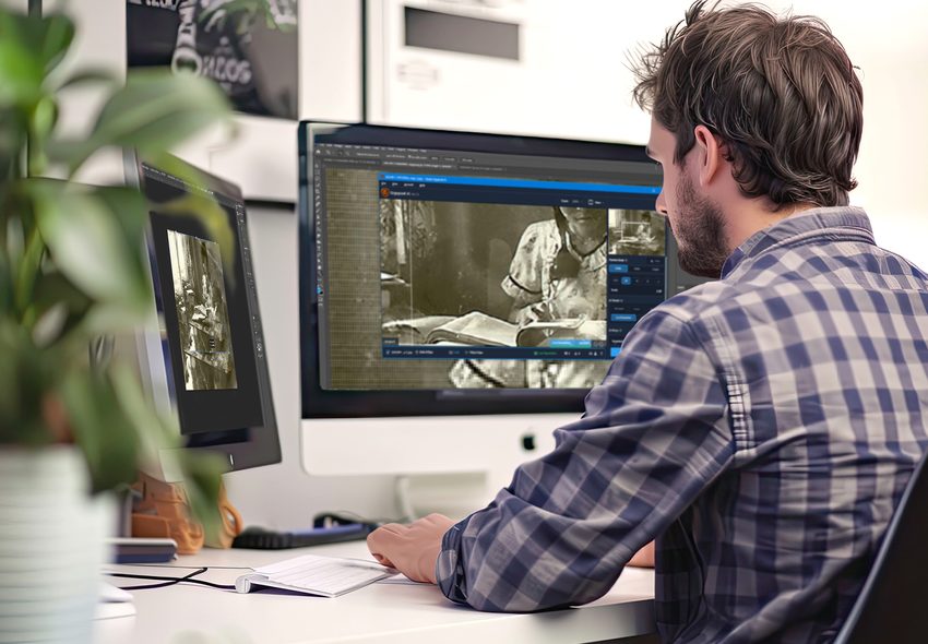
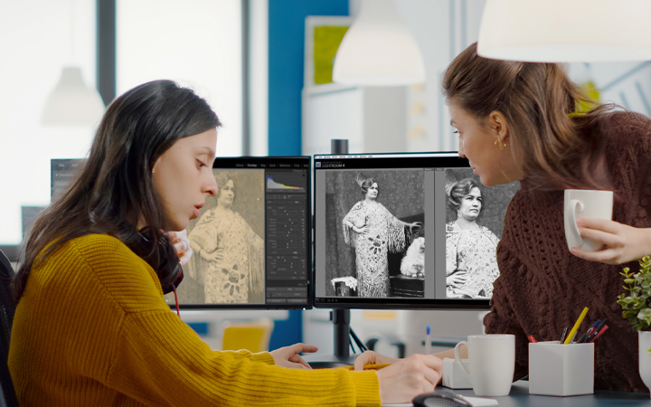
Prints, negatives, slides at 600 DPI with color correction. Photo scanning details →
DVD & CD Transfer
DVDs and CDs transferred to high-quality MP4 and MP3 files with secure cloud delivery
Slide & Negative Scanning
Professional 35mm slide and negative scanning for mounted, unmounted, and strip formats
Not sure where to start? We will help you figure out exactly what you have and what it needs.
Video8 and Hi8 Transfer in Palm Bay
Palm Bay families near Turkey Creek Sanctuary and throughout the Bayside Lakes community captured kids' sports events, holiday mornings, and backyard adventures on Video8 and Hi8 camcorders. Those tapes hold precious moments our professional service converts to lasting digital files.
- Video8, Hi8, Digital8 accepted
- Professional playback decks
- Color and brightness enhanced
- Universal MP4 format
- Careful handling and return
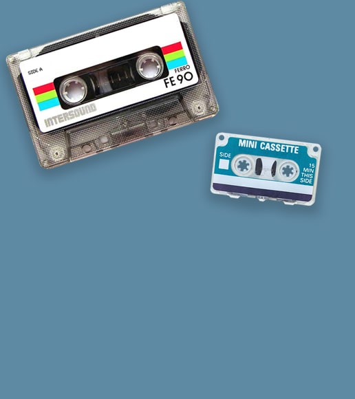
Audio Cassette Digitization in Palm Bay
Palm Bay residents have cassette recordings of family stories, church services, and personal mixtapes stored throughout their homes on the Space Coast. We convert every cassette to studio-quality digital audio, preserving those irreplaceable sounds for future generations.
- High-fidelity audio transfer
- Noise and hiss reduction
- MP3 and WAV formats
- Both tape sides captured
- Fast processing turnaround
Photo Scanning for Palm Bay Families
From photos of rocket launches visible from Palm Bay backyards to family portraits and school milestones, your printed memories deserve digital preservation. We scan each image at high resolution with color correction, delivering files that are easy to share and safe from damage.
- Professional flatbed scanning
- Auto color and exposure fix
- All sizes and formats accepted
- Digital folders by category
- Originals returned protected
Palm Bay's Media Preservation Challenges
Brevard County faces unique coastal threats to stored media:
Atlantic Ocean salt air is relentless along the Space Coast. Even homes miles inland in Palm Bay experience elevated salinity that corrodes tape housings and accelerates photo degradation. Hurricane seasons bring direct coastal storm surge risk, and the Indian River Lagoon's proximity keeps ambient humidity high year-round. Neighborhoods near Turkey Creek and the southern Brevard waterways face particular flood risk during tropical systems.
Palm Bay's rapid growth since the 1960s means the city is full of families who arrived during the aerospace boom and brought lifetime collections of photographs, home movies, and audio recordings with them. Those collections are now 40 to 60 years into Florida's climate.
This is not a someday project. Every year of delay means more irreplaceable content lost to moisture, mold, and mechanical failure. Your family's memories deserve preservation now.
We built Forever Studios because every family deserves to have their memories preserved the right way, by real people, with real equipment, under one roof. Palm Bay families trust us because we treat their collections the way we would treat our own.

Request Your Shipping Kit
Call us or fill out our form. We will ship a prepaid, insured kit directly to your Palm Bay home. No cost, no obligation.
Pack Your Collection & Ship It Back
Place your tapes, photos, or film into the kit. Seal the box and drop it at any UPS location in Brevard County. Prepaid label included.
We Digitize In-House
Each item individually handled with professional equipment. No outsourcing, no third-party labs. Everything stays under our roof in Boca Raton.
Quality Check & Delivery
Results delivered via USB, cloud, or DVD. Originals returned safely to your Palm Bay address. Turnaround: 3-4 weeks.
What Palm Bay-Area Customers Are Saying
"I had a very small, small job. I was treated like royalty. The ladies at reception were the utmost professionals. The staff maintained terrific communications regarding the job’s status. It was s bit of a drive from WPB, but well worth it."
Lisa, Verified Customer
"Received my link, very easy process. Shipping, status updates, app usage all were terrific. Even came through with a delivery right before Christmas. Was able to re-live memories with all my families over the holidays. Thank you Forever Studios"
Scott, Verified Customer
"I live in Boca Raton, and it's so great being able to drop off my film and video to a real human being, and know that they are going to do quality work, at a fair price, and when it's done I will safely get everything back. I've always hesitated to drop my valuable memories in a box and ship it off to parts unknown, but Forever Studios has made converting my old tapes easy. Five stars!"
Rob, Verified Customer
Rated 4.97/5 from 3,700+ verified reviews on Reviews.io
Palm Bay, FL: Local Guide
"Palm Bay is a Space Coast city built by the families who came to launch rockets and stayed to raise their kids. The home movies and photo albums in their closets tell the story of a community that grew up alongside America's space program."
Must-Visit Landmarks & Culture
Kennedy Space Center Visitor Complex
The iconic gateway to NASA's launch operations. Exhibits on Mercury, Gemini, Apollo, and the Space Shuttle. Bus tours to launch pads and the Vehicle Assembly Building.
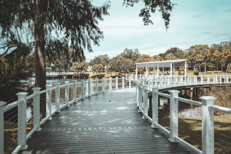
Turkey Creek Sanctuary
117-acre urban nature sanctuary with elevated boardwalks through sand pine scrub, hardwood hammock, and along the creek. A peaceful escape in the heart of Palm Bay.

Melbourne Beach
Quiet barrier island beach just east of Palm Bay. Sea turtle nesting site, uncrowded shoreline, and the Sebastian Inlet at its southern tip for surfing and fishing.
Castaway Point Park
Indian River Lagoon waterfront park with fishing pier, kayak launch, picnic areas, and sunset views. A favorite gathering spot for Palm Bay families.
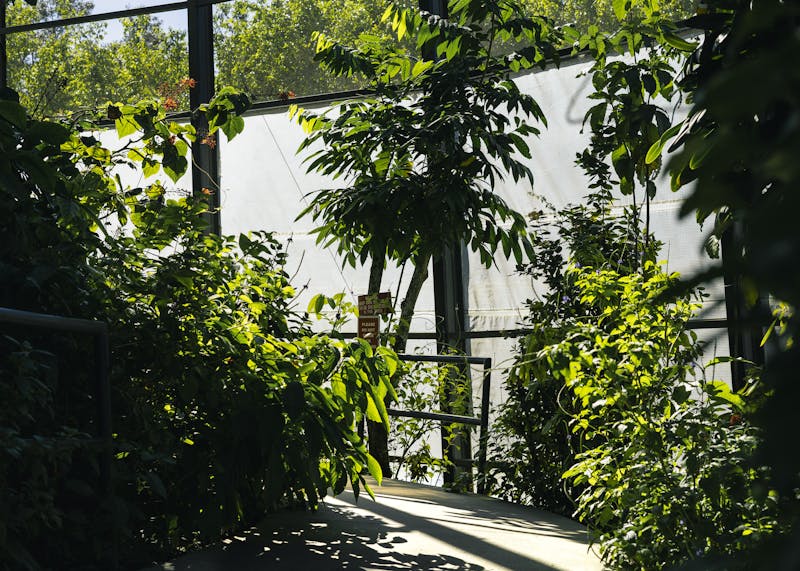
Malabar Scrub Sanctuary
390-acre preserve protecting endangered Florida scrub habitat south of Palm Bay. Hiking trails through ancient dunes with views of the Indian River. Home to scrub jays and gopher tortoises.
Indian River Lagoon
North America's most biodiverse estuary, running along Palm Bay's eastern boundary. Over 4,000 species of plants and animals. Fishing, kayaking, and dolphin sightings year-round.
Neighborhoods We Serve
Frequently Asked Questions: Palm Bay
What media do Palm Bay families commonly need digitized?+
VHS tapes are the most frequent, capturing family life, youth sports, and Space Coast living. Photo collections, Hi8 and MiniDV tapes, and 8mm film are also common. Many Palm Bay families have roots in the aerospace industry and may have media from multiple relocations.
How do I ship my tapes from Palm Bay?+
Our prepaid shipping kit makes it simple. We send packaging materials and a prepaid USPS label. Priority Mail from Brevard County to our Boca Raton studio takes about 2 days. Everything is insured and tracked.
Can you digitize recordings from Melbourne beaches and space launches?+
Yes. Space launch footage recorded from backyards and the Indian River, along with beach recordings from Melbourne and the Brevard County shore, are common from Palm Bay families. These are genuinely unique media that deserve preservation.
My family worked at Kennedy Space Center and has tapes from that era. Can you handle those?+
Absolutely. Personal recordings related to KSC and the space industry are historically fascinating. We digitize all personal footage at the highest quality, preserving your family's connection to the Space Coast's legacy.
Do you handle audio cassette recordings?+
Yes. Audio cassettes are a standard format we convert. We transfer them to high-quality digital audio files (WAV or MP3) that play on any modern device.
What is the typical turnaround for a Palm Bay order?+
Shipping takes about 2 days each way. Processing is 2 to 4 weeks depending on order size. Total turnaround from ship-out to receiving your digital files is typically 3 to 5 weeks. Rush service is available.
Can I digitize VHS tapes I recorded myself of TV programs?+
We can digitize any VHS tape. However, if the recordings contain copyrighted broadcast content (TV shows, movies, sporting events), the digital copies are for your personal use only and may not be distributed.