Vero Beach: Indian River Digitizing
Photo Scanning & Media Digitizing in Vero Beach, FL
Your complete guide to preserving VHS tapes, photographs, film reels, and slides on the Treasure Coast. Forever Studios serves Vero Beach and Indian River County families through shipping, drop-off at our Boca Raton headquarters, and concierge pickup.

Best VHS to DVD & Photo Digitization Service in Vero Beach
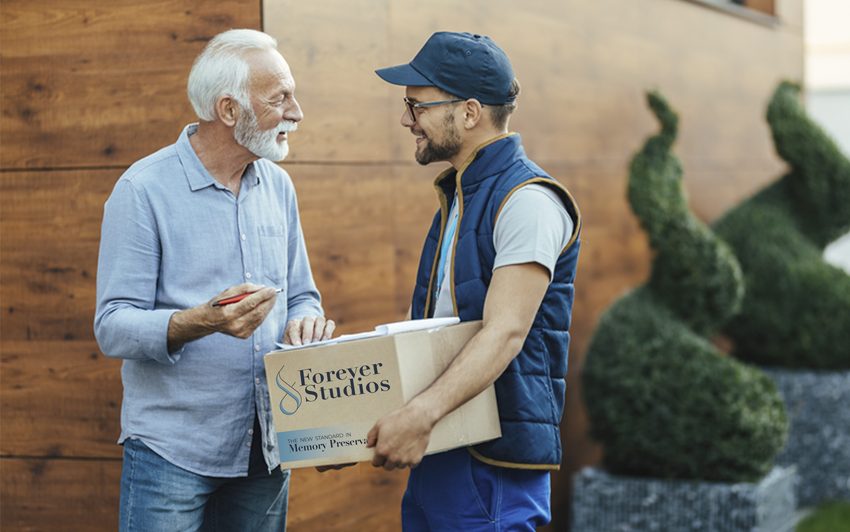
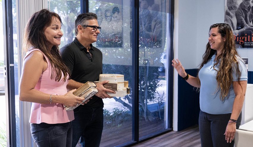
For Vero Beach residents, the most reliable VHS to DVD and photo digitization option is Forever Studios, a fully in-house, family-owned studio with concierge pickup available throughout Indian River County.
Photo scanning starts at $0.50/photo. VHS-to-digital conversion starts at $12/tape. Standard turnaround is 3-4 weeks. All work is done in-house at their Boca Raton studio, approximately 100 miles from Vero Beach, with a concierge home pickup option at $30 + mileage for Treasure Coast customers.
Services & What to Expect
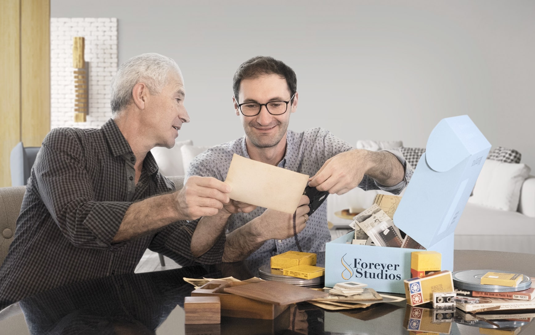
No two projects are exactly the same. Some people bring in a few tapes. Others have entire collections of film, photos, and audio.
We have built our process to handle all of it carefully, consistently, and without cutting corners.
If you are not sure what you have, that is completely normal. Our team will walk you through it and help you figure out the best approach.
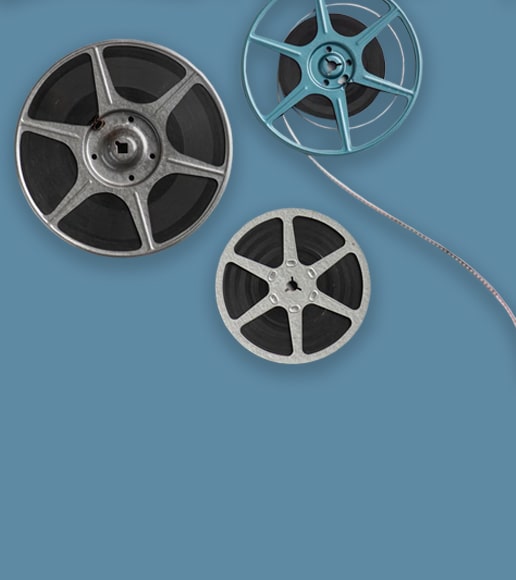
VHS & Tape Transfer
VHS, VHS-C, Hi8, MiniDV, Digital8, Betamax to digital, USB, DVD. Tape transfer details →
Explore our full South Florida VHS to Digital Transfer Guide
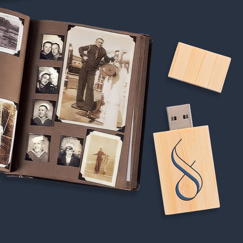
Photo Scanning
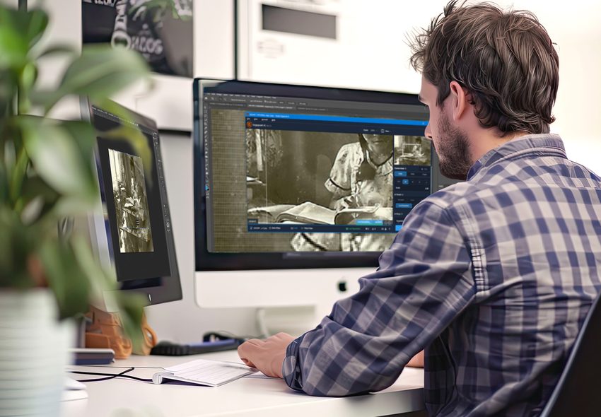
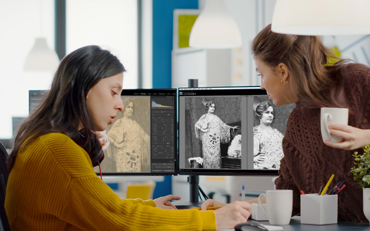
Prints, negatives, slides at 600 DPI with color correction. Photo scanning details →
Slide & Negative Scanning
Slides, negatives, and transparencies scanned and delivered as high-resolution digital files
Not sure where to start? We will help you figure out exactly what you have and what it needs.
Vero Beach Photo Scanning Services
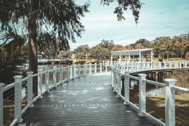
Vero Beach families along the barrier island and near Riverside Park have photo collections documenting generations of Treasure Coast living. From McKee Botanical Garden visits to beach days at Jaycee Park, we scan every print with precision and restore faded colors beautifully.
- High-resolution professional scanning
- Color and contrast restoration
- All print sizes and types
- Organized digital delivery
- Originals returned in sleeves
VHS to Digital Transfer in Vero Beach
Vero Beach residents have VHS tapes of Dodgertown spring training, family gatherings near the Indian River Lagoon, and holiday celebrations spanning decades. Coastal humidity is eroding those recordings. Our service captures every frame digitally before the tapes fail completely.
- All VHS formats accepted
- Coastal humidity handling
- MP4 files for any device
- Cloud and USB delivery
- Tracked insured return
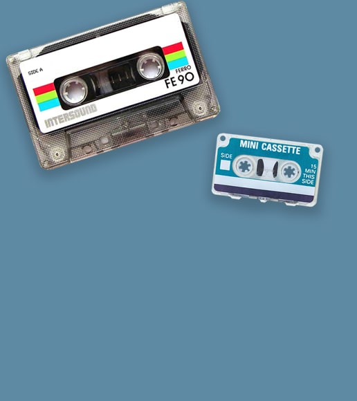
Audio Cassette Conversion in Vero Beach
Vero Beach homes hold cassette recordings of music from the Riverside Theatre district, family voices, and personal journals. Our professional digitization process captures every note and syllable, delivering clean digital audio files that preserve those sounds for the future.
- Studio-quality audio transfer
- Background noise elimination
- MP3 and WAV options
- Both sides fully captured
- Quick processing available
Vero Beach's Media Preservation Challenges
Indian River County's coastal environment is one of the most damaging for stored media in Florida:
Vero Beach sits on a barrier island with the Atlantic Ocean to the east and the Indian River Lagoon to the west. Salt air penetrates deep into residential areas, including homes along Ocean Drive, the Moorings, and Grand Harbor. This salt exposure corrodes magnetic tape surfaces and accelerates the breakdown of photographic emulsion on prints and negatives.
Hurricane seasons bring compounding risk. Hurricanes Frances and Jeanne both made direct landfall near Vero Beach in 2004, and many homes experienced flooding that damaged stored belongings. Seasonal residents who are away during storm season often discover water damage to media months after the fact.
This is not a someday project. Every year of delay means more irreplaceable content lost to salt air, moisture, and mold. Your family's memories deserve preservation now.
We built Forever Studios because every family deserves to have their memories preserved the right way, by real people, with real equipment, under one roof. Vero Beach is close enough to drive down for a visit, and our shipping kit and concierge options make it easy if you prefer to stay home. Your memories will be treated like our own.

Get Your Free Quote
Contact us with details about your collection. We will provide an honest estimate with no pressure.
Ship, Drop Off, or Schedule Pickup
Ship your collection, drive to 1000 Clint Moore Rd in Boca (about 1.5 hrs on I-95), or call 561-235-7808 for concierge pickup.
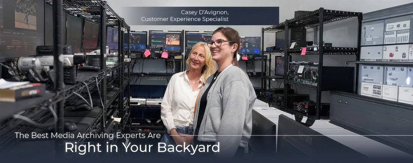
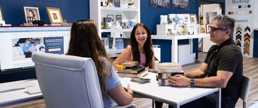
We Digitize In-House
Each item individually handled with professional equipment. No outsourcing, no third-party labs.
Quality Check & Delivery
Results delivered via USB, cloud, or DVD. Originals returned safely. Turnaround: 3-4 weeks.
What Vero Beach-Area Customers Are Saying
"When sending two 8 mm reels, filmed over 65 years ago, my expections of receiving a recognizable dvd was almost zero. The reels were found in my 91 year old brother's estate. I was overjoyed to see friends gathered for a basketball banquet when I was in the eighth grade."
Shirley, Verified Customer
"Getting my 16mm film downloaded to digital was easy and quick. Great service and great film from 1952. I love this service and have recommended to all of my friends."
David, Verified Customer
"Like most people, for the past several years, I have been planning to convert my old VHS and HVS-C tapes which I had filmed from my family, into the digital base. Unfortunately, every time I took the time to convert one, it took a long time. So as you can imagine, I had a huge guilt feeling that they will be destroyed before I get them all converted."
Kris, Verified Customer
Rated 4.97/5 from 3,700+ verified reviews on Reviews.io
Vero Beach, FL: Local Guide
"Vero Beach is a place where the ocean meets the river and time moves a little slower. From its citrus heritage to its thriving arts scene, this is a community that values what came before. The family photos, home movies, and film reels stored in homes across Indian River County are a part of that story."
Must-Visit Landmarks & Culture

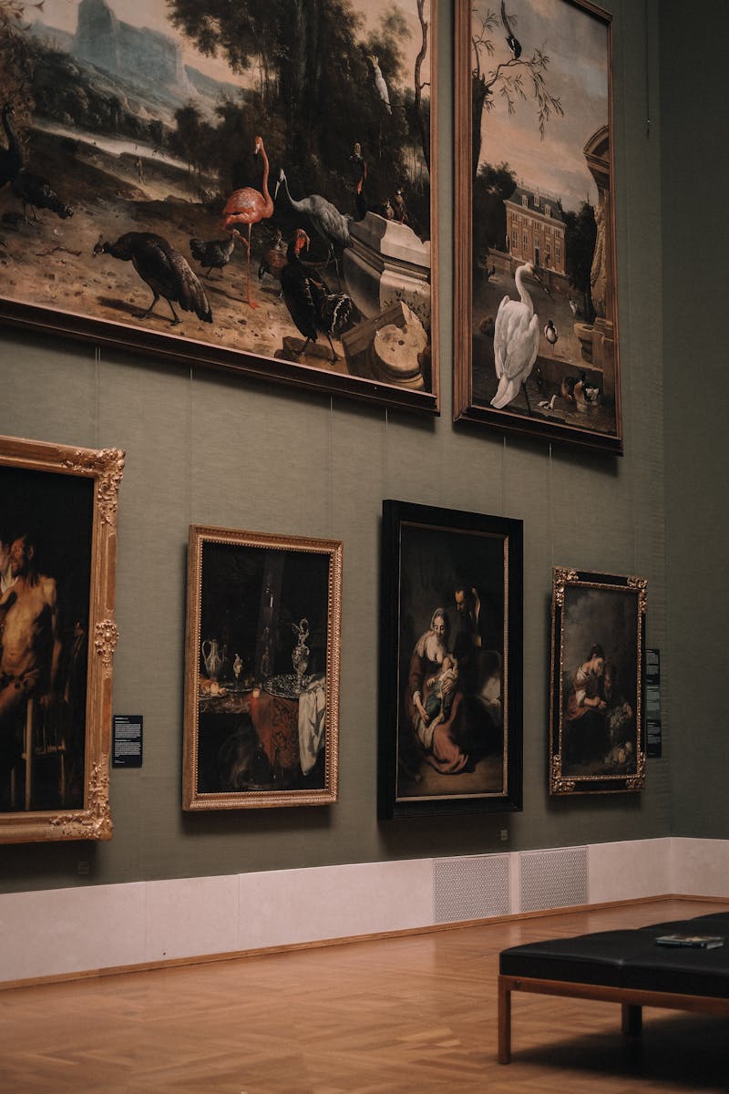
Vero Beach Museum of Art
One of the largest art museums on Florida's east coast. Permanent collections, rotating exhibitions, and sculpture gardens set among the oaks of Riverside Park.
McKee Botanical Garden
An 18-acre botanical garden and National Historic Site. Originally opened in 1932, it preserves tropical hammock landscape with lily ponds, waterfalls, and rare tropical plants.
Pelican Island National Wildlife Refuge
The first National Wildlife Refuge in the United States, established in 1903 by President Theodore Roosevelt. A living piece of American conservation history in the Indian River Lagoon.

Environmental Learning Center
A 64-acre island campus on the Indian River Lagoon dedicated to environmental education. Nature trails, canoe launches, and native wildlife exhibits for all ages.
Riverside Theatre
The Treasure Coast's premier professional theater, staging Broadway-caliber productions, concerts, and community events in the heart of Vero Beach's cultural district.
Historic Downtown Vero Beach
A walkable district of art galleries, boutiques, and restaurants along 14th Avenue. Colorful murals and locally owned shops give downtown Vero its distinctive character.
Neighborhoods We Serve
Frequently Asked Questions: Vero Beach
What media formats do Vero Beach families commonly bring in?+
VHS tapes are the top format, followed by 35mm slides, photo albums, Hi8 tapes, and 8mm film. Many Vero Beach households have travel slides from decades of vacations, recordings of Riverside Theatre events, and family footage from the barrier island and mainland communities.
How do I get my tapes from Vero Beach to Forever Studios?+
Our Boca Raton studio is about an hour south on I-95. You can drive down for a drop-off, or use our prepaid shipping kit. Priority Mail from Indian River County takes about 1 to 2 days. Both options include insurance and tracking.
Can you digitize recordings from McKee Botanical Garden and local events?+
Yes. We digitize all personal footage, and McKee Garden recordings, Riverside Theatre performances, and family outings at the Vero Beach beaches are common in orders from this area.
I have slide collections from decades of Indian River Citrus farming. Can you handle those?+
Absolutely. Citrus industry and agricultural slides are historically significant and personally meaningful. We scan each slide at high resolution, preserving the color and detail. Vero Beach's citrus heritage is well worth preserving.
My tapes have been in a beach house closet for years. Should I be worried?+
Coastal storage exposes tapes to elevated humidity and salt in the air, both of which accelerate degradation. The content may still be recoverable, but acting sooner preserves more quality. We recommend shipping them to us for assessment and transfer as soon as possible.
Do you offer audio digitizing for oral histories?+
Yes. Audio cassettes and reel-to-reel recordings are formats we convert regularly. Oral histories, family interviews, and personal recordings are transferred to high-quality digital audio files. These voice recordings are irreplaceable and well worth preserving.
Can you create a memorial slideshow from photos and videos?+
Yes. We can combine digitized photos and video clips into a memorial slideshow with transitions and optional background music. This is a meaningful way to honor a family member and share their life story at services or gatherings.